
A Modern Chic Makeover for an Old Apartment in Bangalore
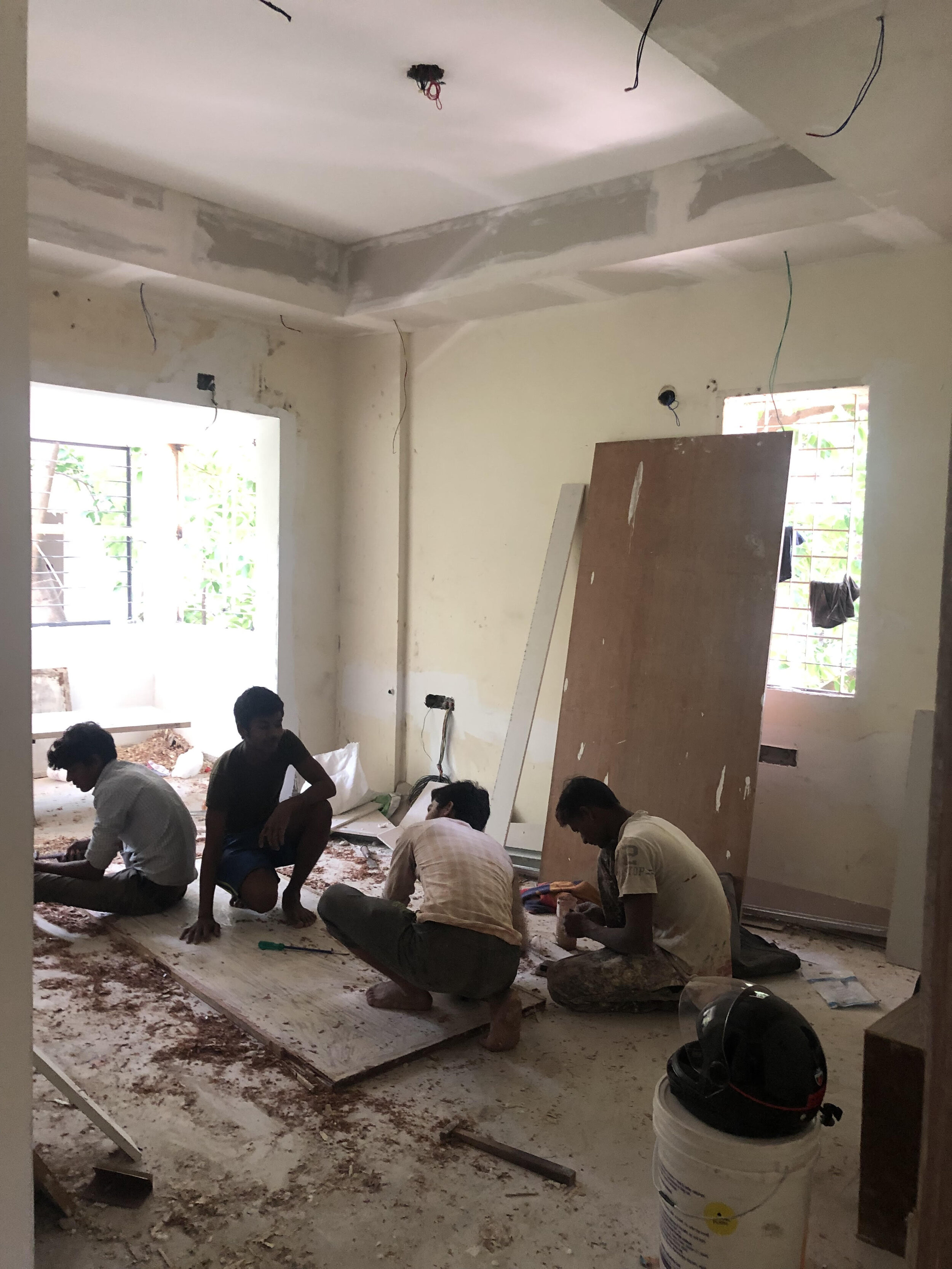
A 30 year old, 1100 square feet apartment had seen better days. Our lovely clients were a newly married couple and the apartment was previously occupied by his grandfather a few years ago. Having been empty for a few years the place was dusty, old and lacked charm and style.
Our clients had their mind set about starting renovation with the goal to retain the good bones of the apartment but at the same time add in modern & contemporary elements.
Keeping their budget in mind, we restored a lot of pieces back to life and also added in modern influences to the space.
This apartment had potential. Let’s walk through each room, so I can discuss the design further & the changes we made in detail! So lets begin…
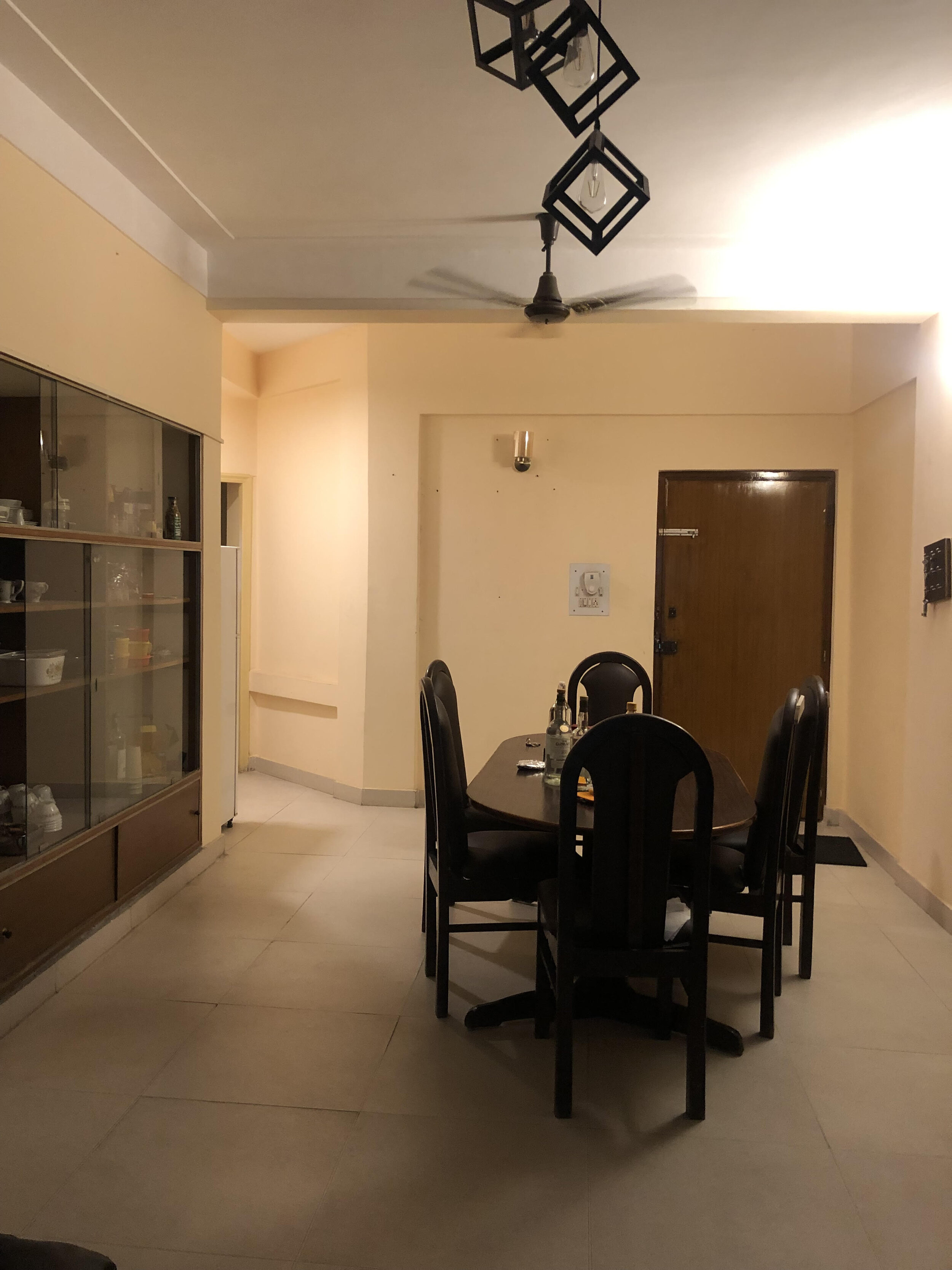
The Dining Room
Before:
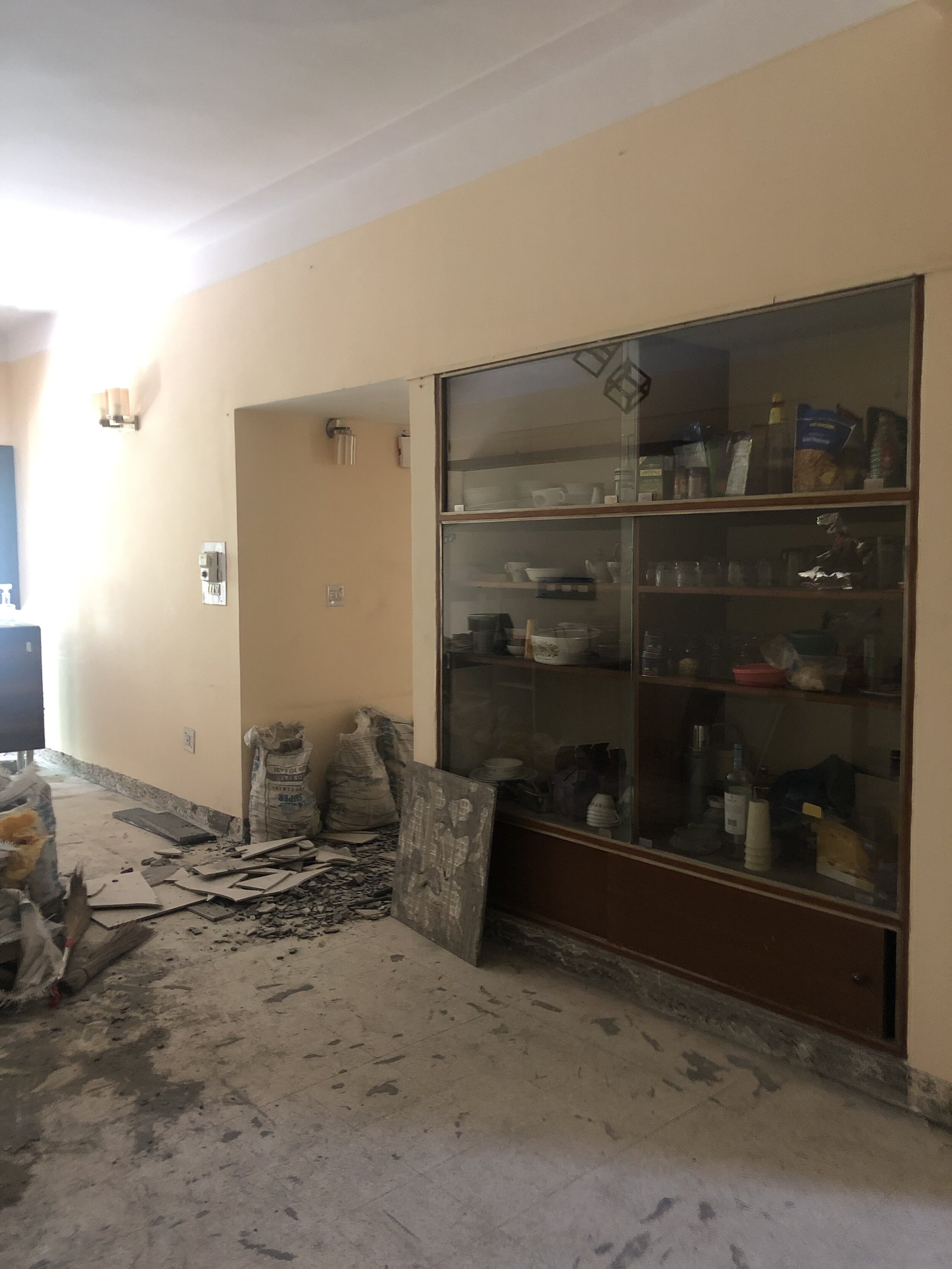
This home isn’t very spacious and the biggest challenge we faced was that the main door opened directly into the dining area. We tried proposing a sleek partition initially and designing a 4 seater table, trying to create a landing for a foyer zone but none of it worked out as the clients wanted to reuse their old teak dining table. Some things are sentimental and since it was a large table we couldn't really fit in anything else!
After:

Since we reused the same table, we re-purposed their old dining chairs. We changed the shape of the old curved chair to a more sleek high back tufted chair, bringing in that modern feel to the space.
The old built-in crockery unit was poorly designed & really had to be changed. We designed another built-in crockery unit according to their storage needs, along with cutlery draws and a puja niche in the corner fit in with built in lighting as well!

The diamond patterned mirror brings in that right contemporary edge and vibe to the home!
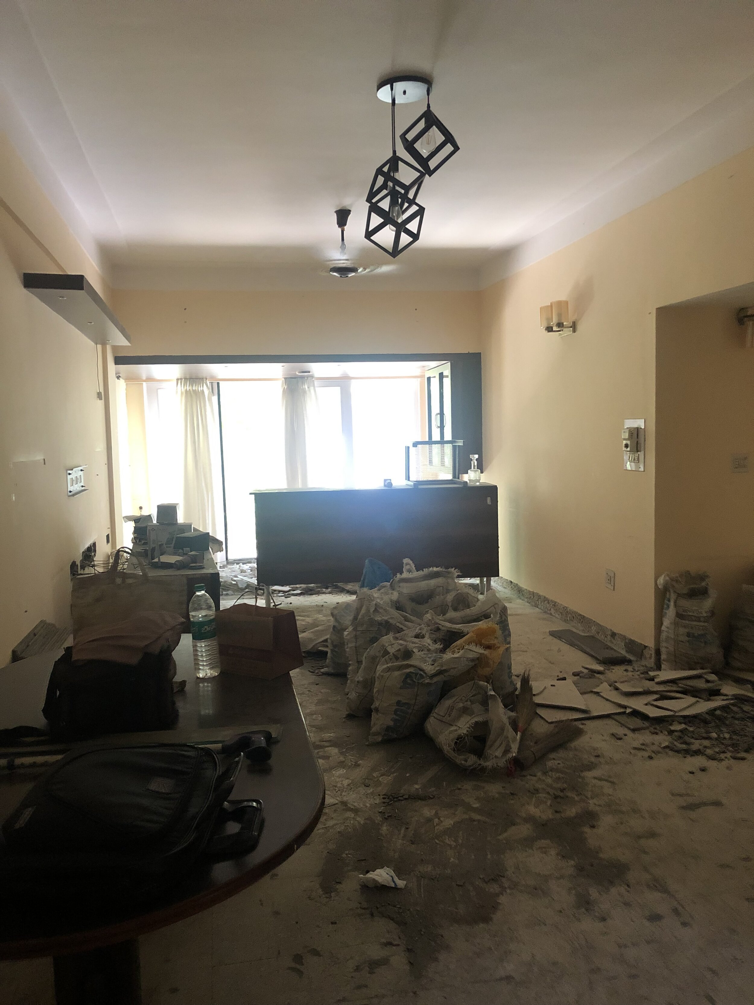
The Living Room
Before:
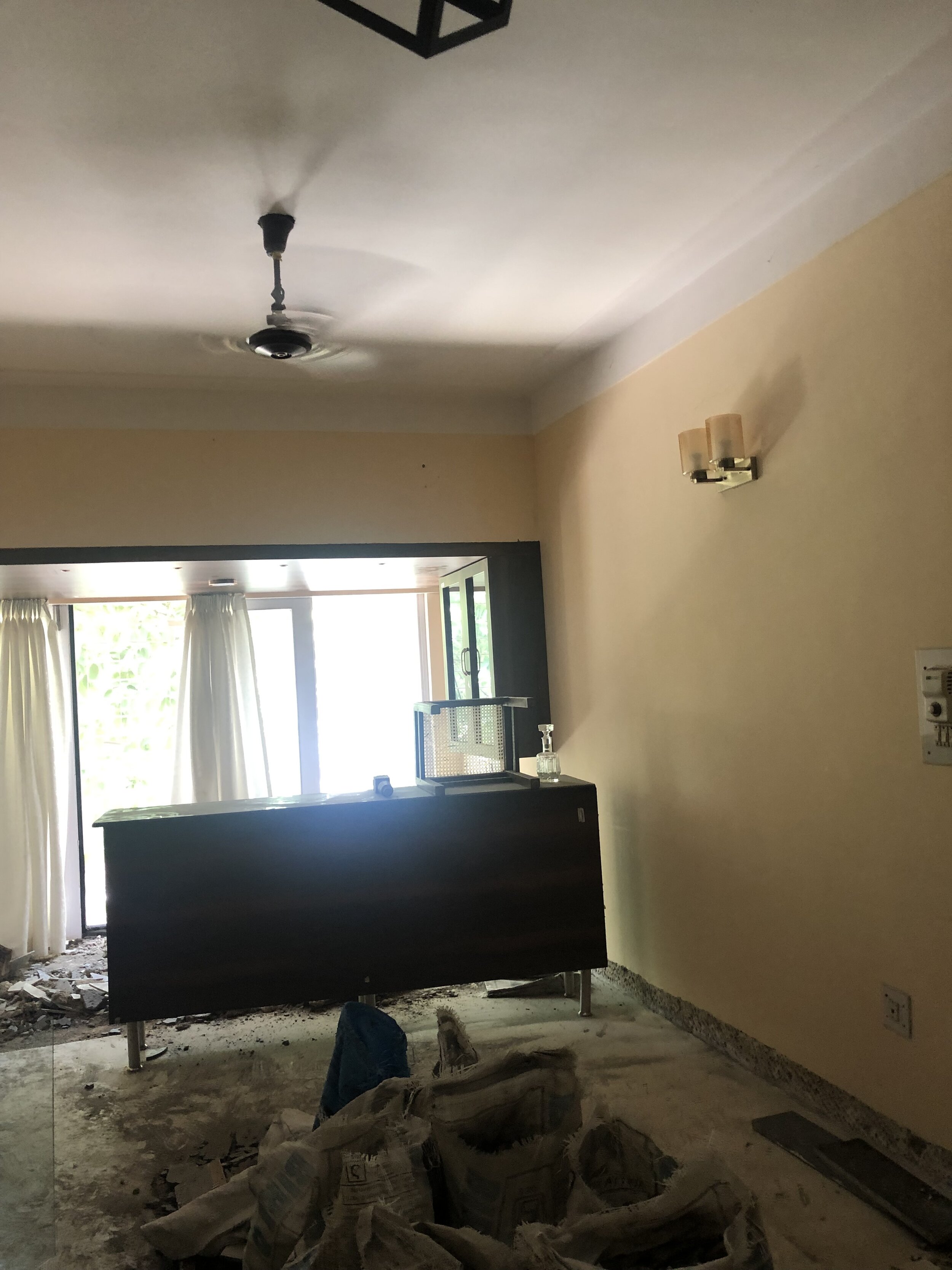
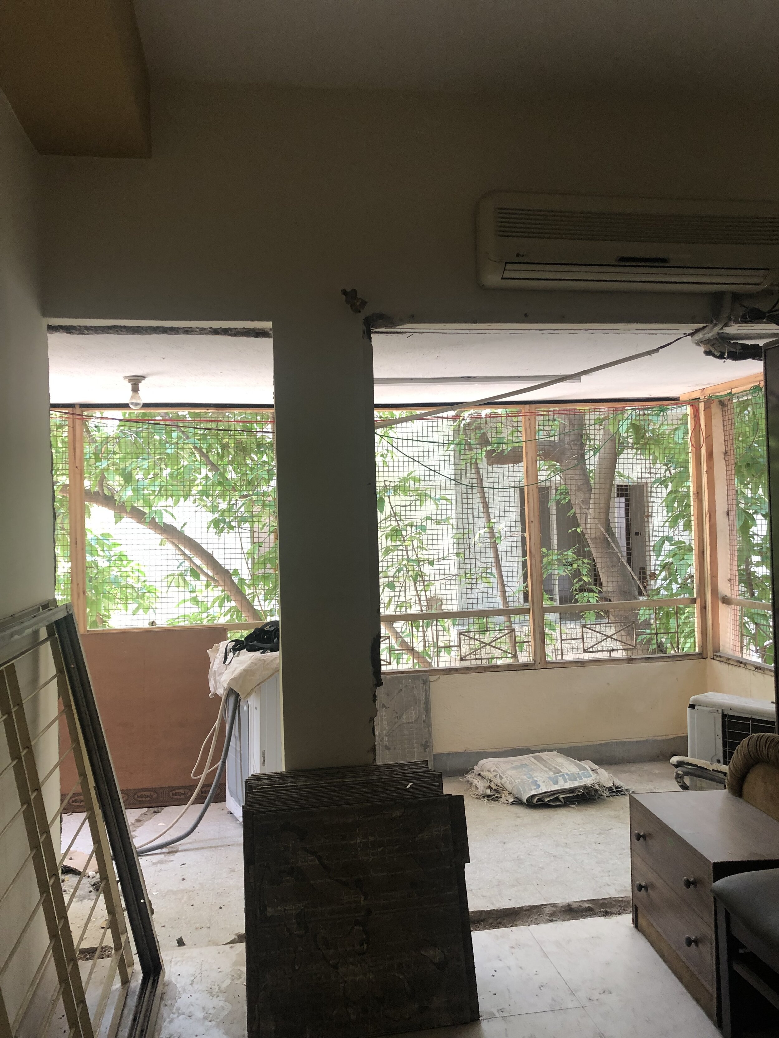
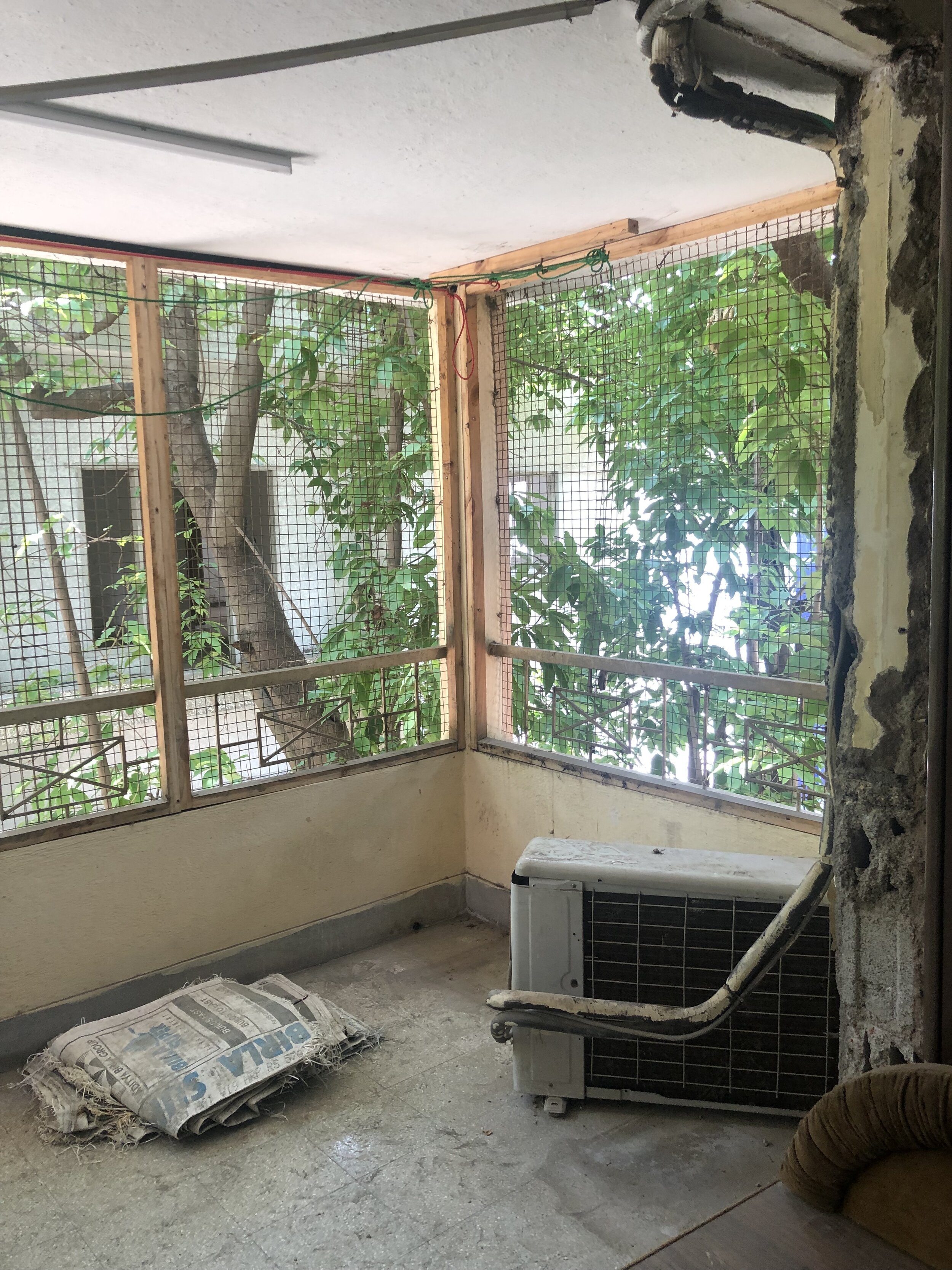
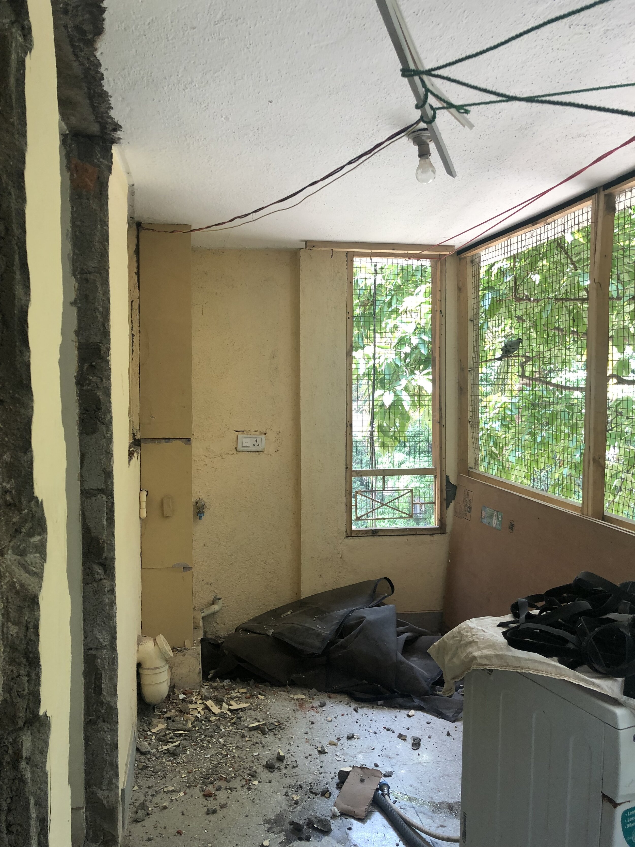
The client had previously done a bit of restoration, he had modified the end of the living room to a bar area finished with wood detailing all round so we retained that. Here he brought the balcony in as we did as well in the other rooms. We intended to design the spaces rather to serve function than be unused or used occasionally, a must in a small apartment.
After:

The living room is one space that still isn't complete yet! Still to bring in the sofa, we are thinking of a nice teal L-shaped sofa along with 2 accent chairs. We will re-shoot and share this space on our Instagram as the custom pieces come in!
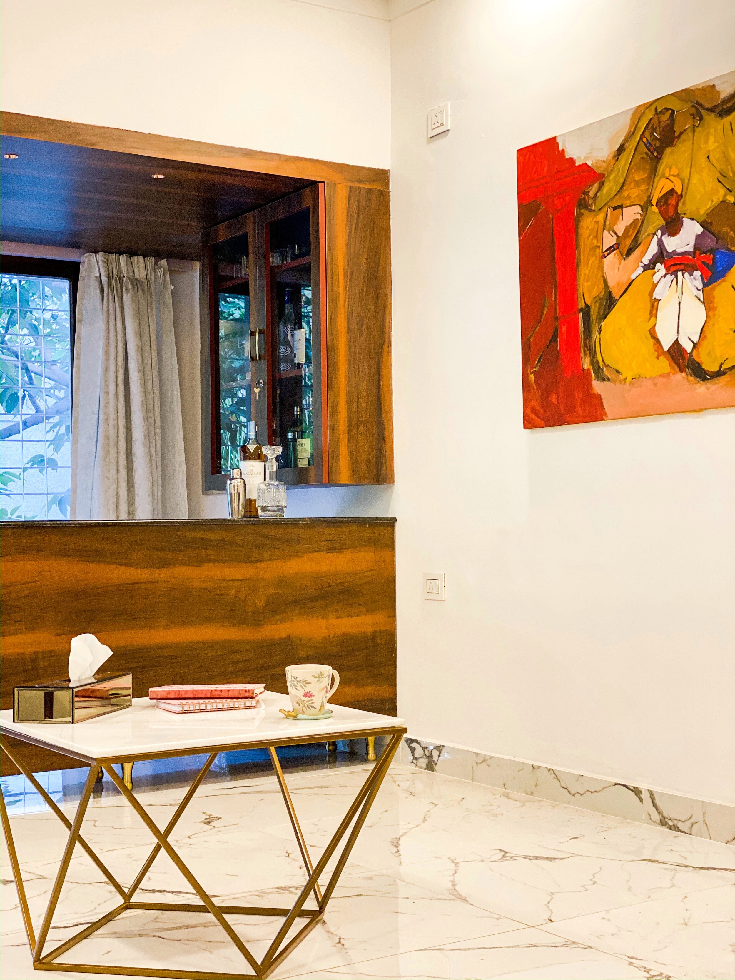
The lovely painting that frames this living room is from P.R. Rathod sourced from iartgallery.
The marble top centre table was sourced from Agra.
We changed the old floor, and it is now covered in a beautiful statuario marble tile. The grey veining on this tile strikes a bold pattern in this entire space.
Lighting! Another thing we completely reworked in the entire home! New wiring, switch boards and false ceilings were designed throughout the home.
The Kitchen
Before:
We removed the bulky units on the left, it was placed so high and wasn’t easily accessible!
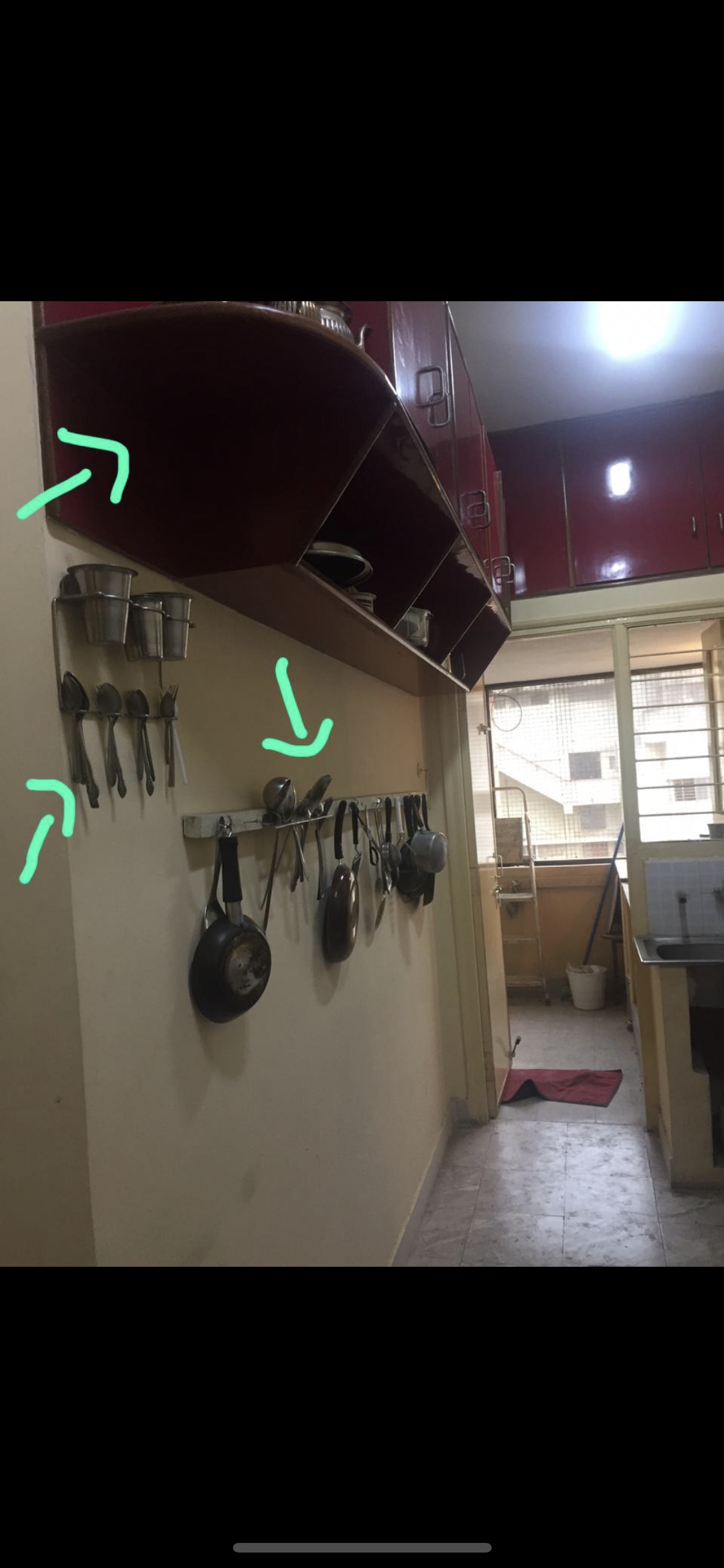
We also changed the layout by keeping things simple and straight, the sink placed at an L-angle just made the space more cramped!
After:
Our clients initially didn’t want to change the kitchen but seeing the whole space slowly transforming they realized the old red kitchen was a misfit. So they told us to design the space without damaging too much and also keeping costs in mind.

What we came up with- adding a bit of design fun with hexagon floor tiles in grey for the young couple, new shutter fronts in a blue hue and a matte grey 2x1 grey tiled backsplash along with some open shelving. Since the kitchen is a narrow, compact space we opted out of upper cabinetry but added in open shelving instead to store their daily spices, cereals, mugs, and a few appliances like their juicer, blender and coffee machine. The storage provided to them at the bottom was sufficient for both of them and since its long most of their things fit right in!
They do have a decent sized utility adjoining the kitchen, here’s where their fridge, ironing table, washing machine and clothes rack is placed. The also have a sink outside so the washing of the dishes as well happens there. The main kitchen serves as a cool and functional dry kitchen!
The Master Bedroom
Before:
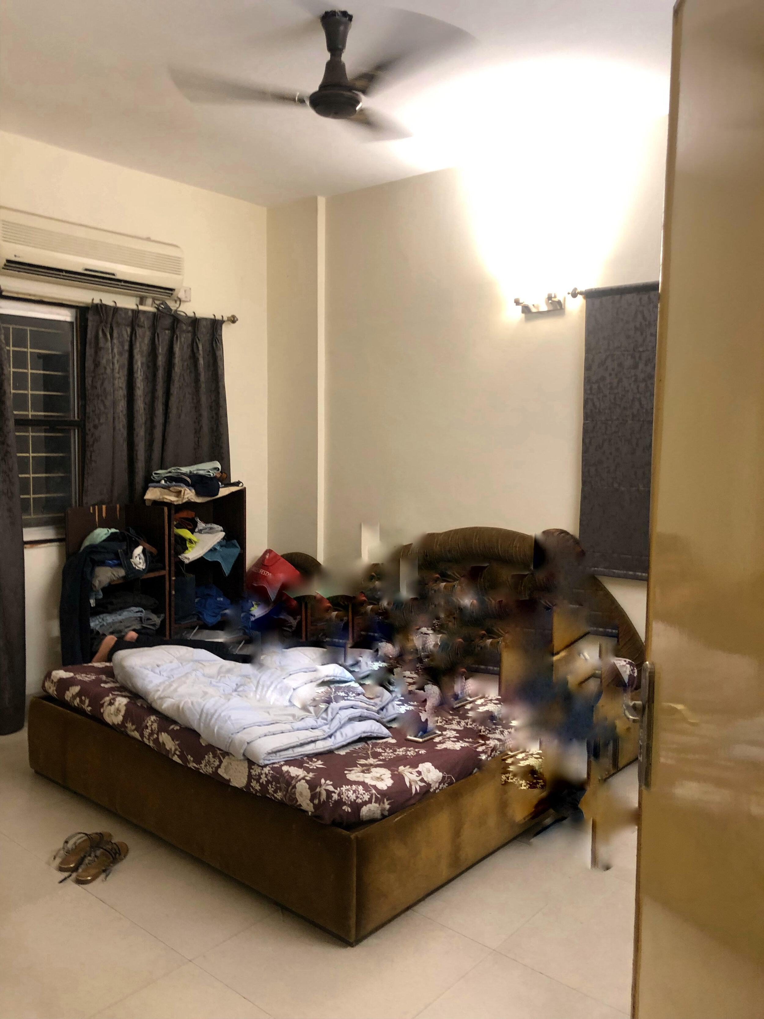
After:
The master bedroom was a small space, here we broke down the window wall and covered the door that leads out into the balcony and brought the outdoors in. By doing so we brought in more natural light into the space and this was key! A bedroom that lacks sunlight can tend to be very depressing, we wanted a bright and airy feel to this bedroom.

They wanted a calm neutral color palette for their bedroom! We stuck to cool colors for a relaxing atmosphere :) We custom made that comfy grey fabric bed with a beautifully tufted headboard and added two custom bed side tables with mirror front detailing. We also installed beautiful new laminate wood floors in the master adding some warmth to the space.

Instead of table lamps we incorporated two pendant lights on either side of the bed. These barely there brass glass pendant lights pop against the white curtains and acts as a subtle design feature. We continued brass detailing all round the room, from the pendants to the knobs and handles on the wardrobes.
We divided the wardrobes into his and her sections! Her wardrobe finished in a lovely creamy white laminate combined with frosted glass shutters sits to the right side of the bed.

His wardrobe in a strong military green color is placed as you enter and turn the corner where you can see the opening in their bedroom.


Since this was initially supposed to be a balcony the bathroom window opens out into this space so we couldn't fit in a full length wardrobe here so we decided to add a chest of drawer in a contrast tweed laminate framed in black for him as a small dress up corner.
We also managed to fit in a shoe cupboard at the very end for both of them with a mirror on one shutter.

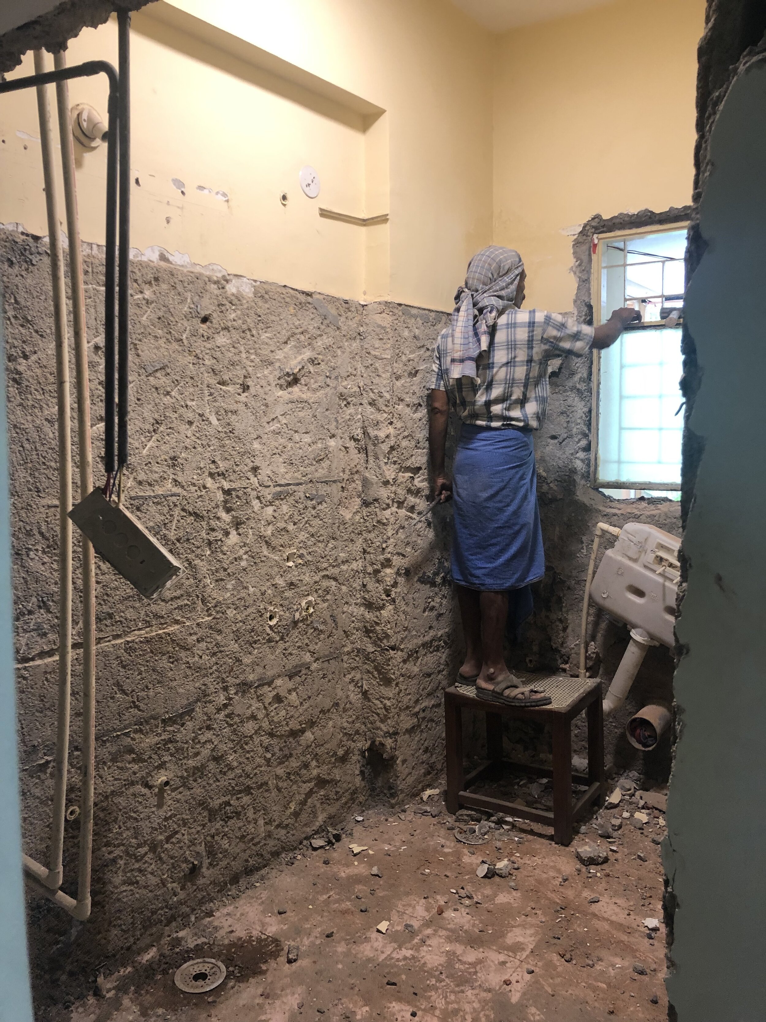
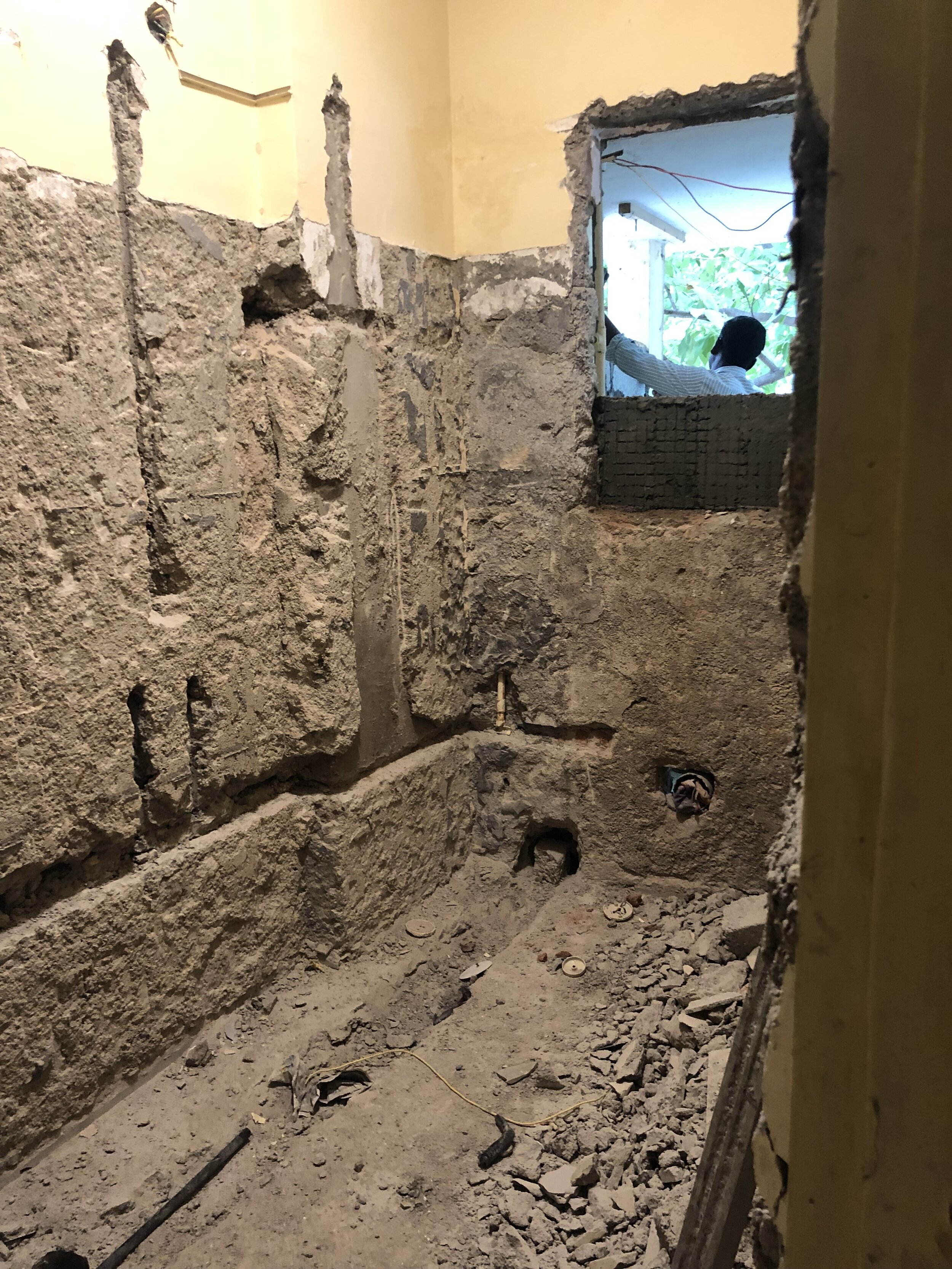
The Master Bathroom
Before:
A total bathroom makeover is not always easy or possible. But after checking plumbing lines we managed to shift the position of the toilet and the shower. Previously the toilet sat below the window, we moved it to the centre of the room and by doing so we got a nice shower area. We also shortened the window height and incorporated a niche to store their shower supplies!
After:
This bathroom is a dark beauty!

We love the design of this bathroom so much!!
Dark bathrooms add so much mood to a space and if done right can be very beautiful & I think we managed to do just that! We did a herringbone patterned wall tile for the shower wall, this works as a highlight and also helps our eye travel vertically as we wanted to emphasize the high ceiling in this space. All the sanitary fittings are from Kohler’s french gold range and we even managed to match the shower rod to the same color as the fittings. It’s these little touches that matter a lot in design!

HOLY HERRINGBONE!
We custom chose the tile, color and size we wanted for the herringbone patterned tile feature wall. By using a precise water jet cutting technique we got the desired effect we wanted. A darker grey epoxy grout brings out the pattern and tile formation of this gorgeous shower wall.
We kept the vanity simple and in a white glossy laminate finish. The same french gold finished knob ties in the space long with the globe light over a simple frameless round mirror.

This is a two bedroom two bath apartment but we didn’t change a lot in the other bedroom and bathroom.
This concludes this lovely home tour! I sure do hope you'll enjoyed this design walk through. Comment below and we’d love to know your thoughts or answer any questions you may have!
Happy 2020 everybody!!
To more blogs and projects to be revealed in the coming year… :D