
A Transitional Classic Home Makeover with Expansive City Views!
We started designing this project in June and we are excited to take you’ll through this beautiful transitional home that we re-designed, decorated and styled! Our clients a couple with two young kids had just renewed their 5 year long-term rental agreement and wanted a change or a fresh outlook to their already lived in space. The apartment is a 3000 sqft 4 bedroom flat, and we were commissioned to re-do the living, dining, balcony and two bedrooms.
Our inspiration for the home came from our clients exquisite pieces itself. Rashmme loves art, antiques and decor and we had the opportunity to chose from some lovely art & artefacts from her very own museum. Since she’s a collector of things we wanted the space to have a sophisticated and personalised feel. Most of her stuff was packed away and we found interesting new ways in displaying them around her home!
All Photographs Courtesy: Nayan Soni
The Living Room
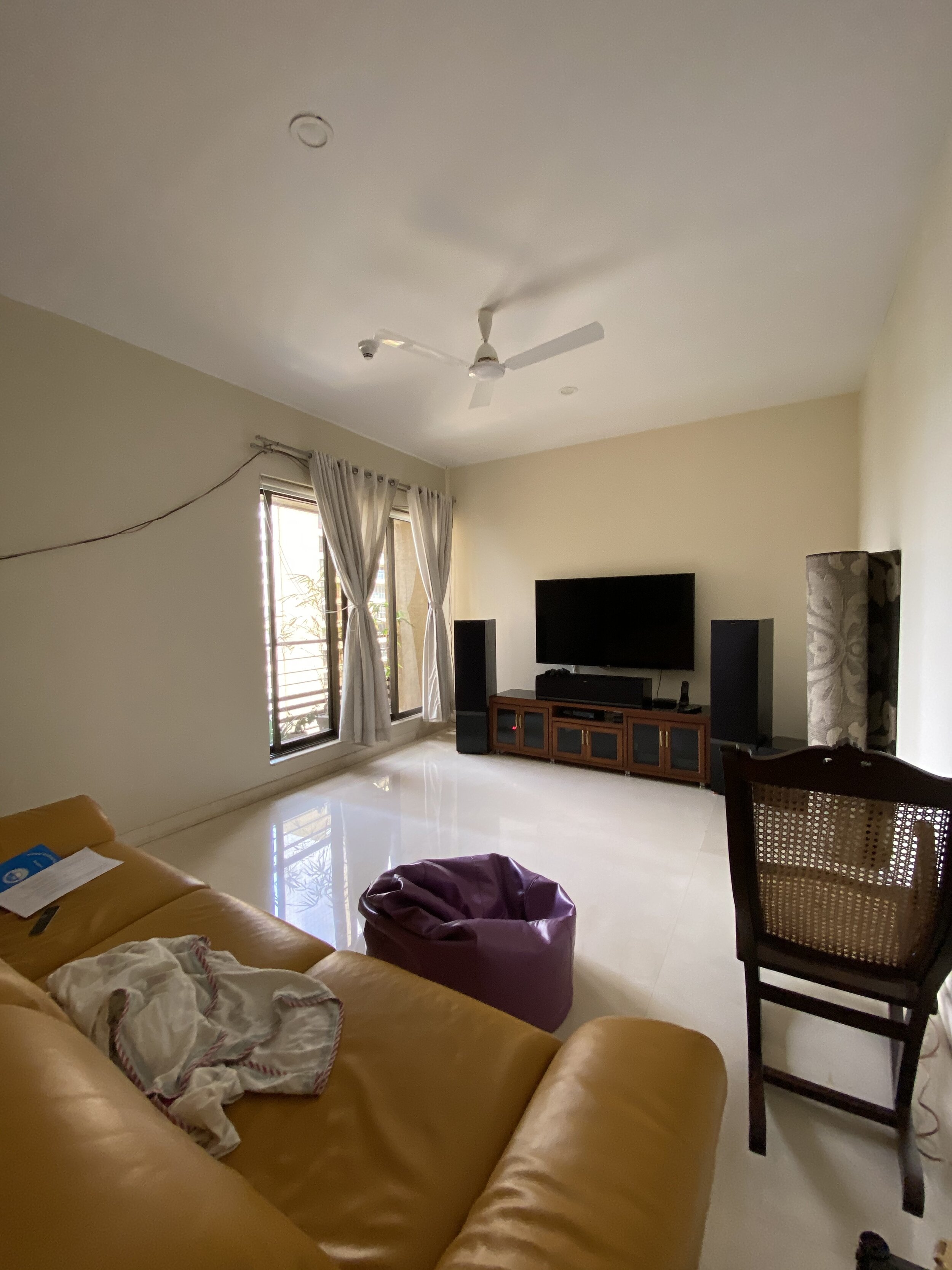
Before:
In the before pictures you will notice the room was functional but was craving personality! The seating layout was sparse and made the room feel empty. Sometimes something as simple as changing out old fabrics and carpets can change the look of the room, and that’s what we did in this living room! The art was also spread out, or either too high up in the room. Tip: Place your art 6”-8” above the sofa, I don’t mind going a few inches higher but not more.
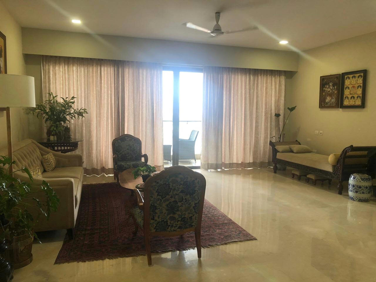
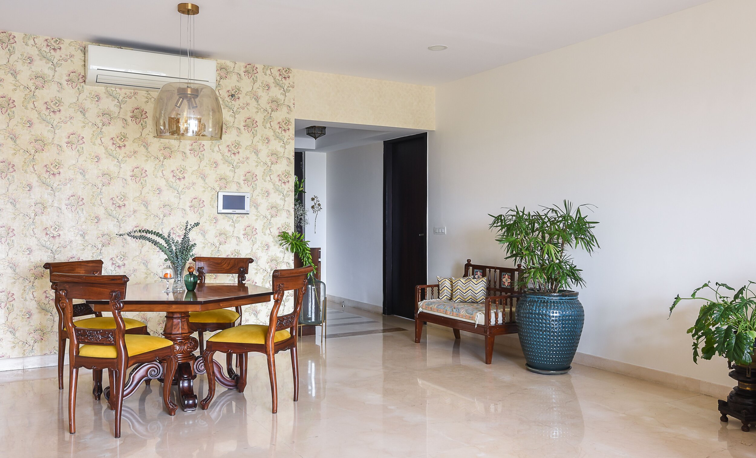
When I first saw the space I knew I wanted to brighten up the apartment and add more seating and lighting to the room. Their previous walls were darker… A fresh coat of paint can do wonders! We used the shade morning glory from Asian paints for the walls and a bright white for the ceiling, now the room feels cheery and vivid.
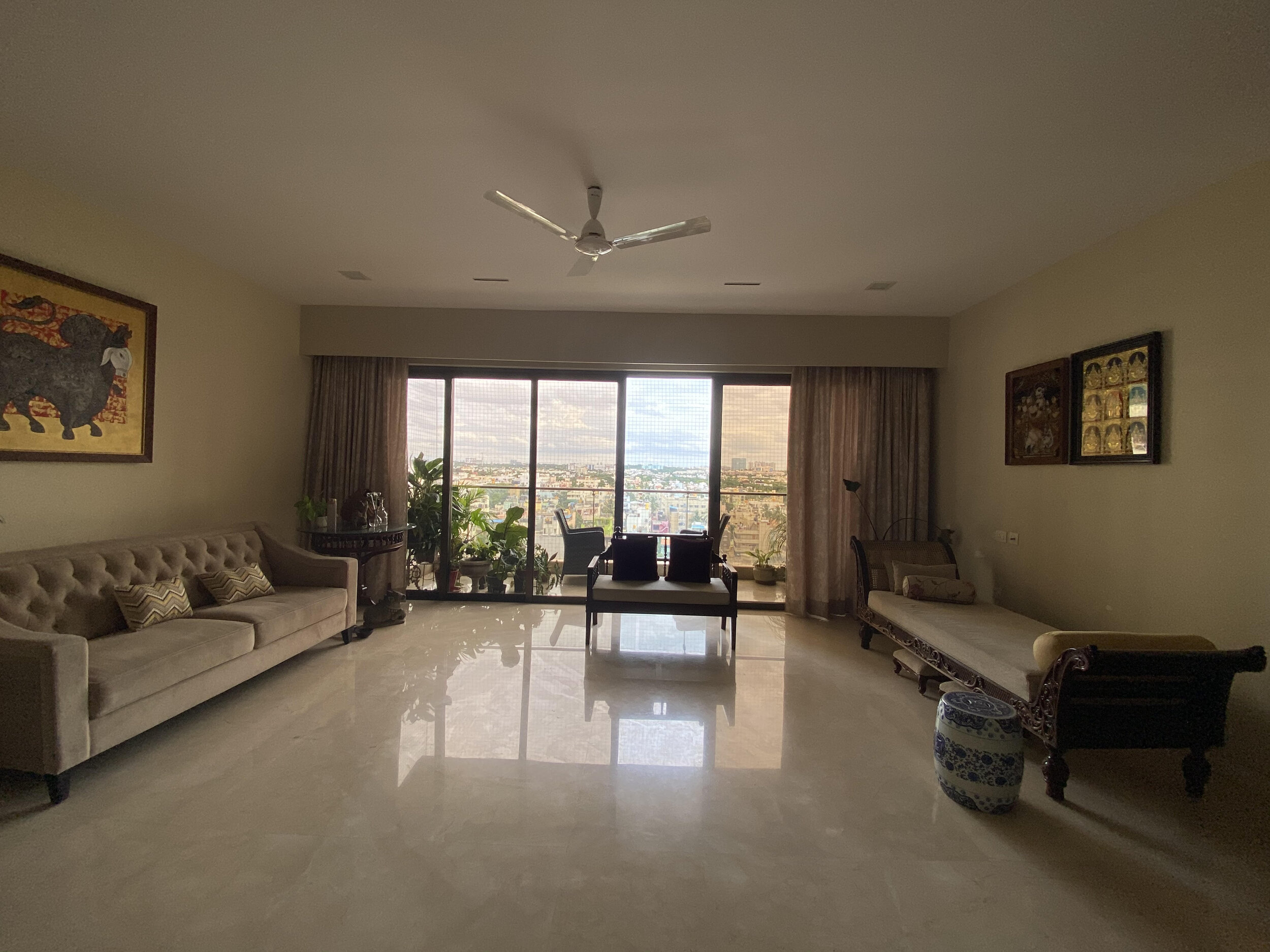
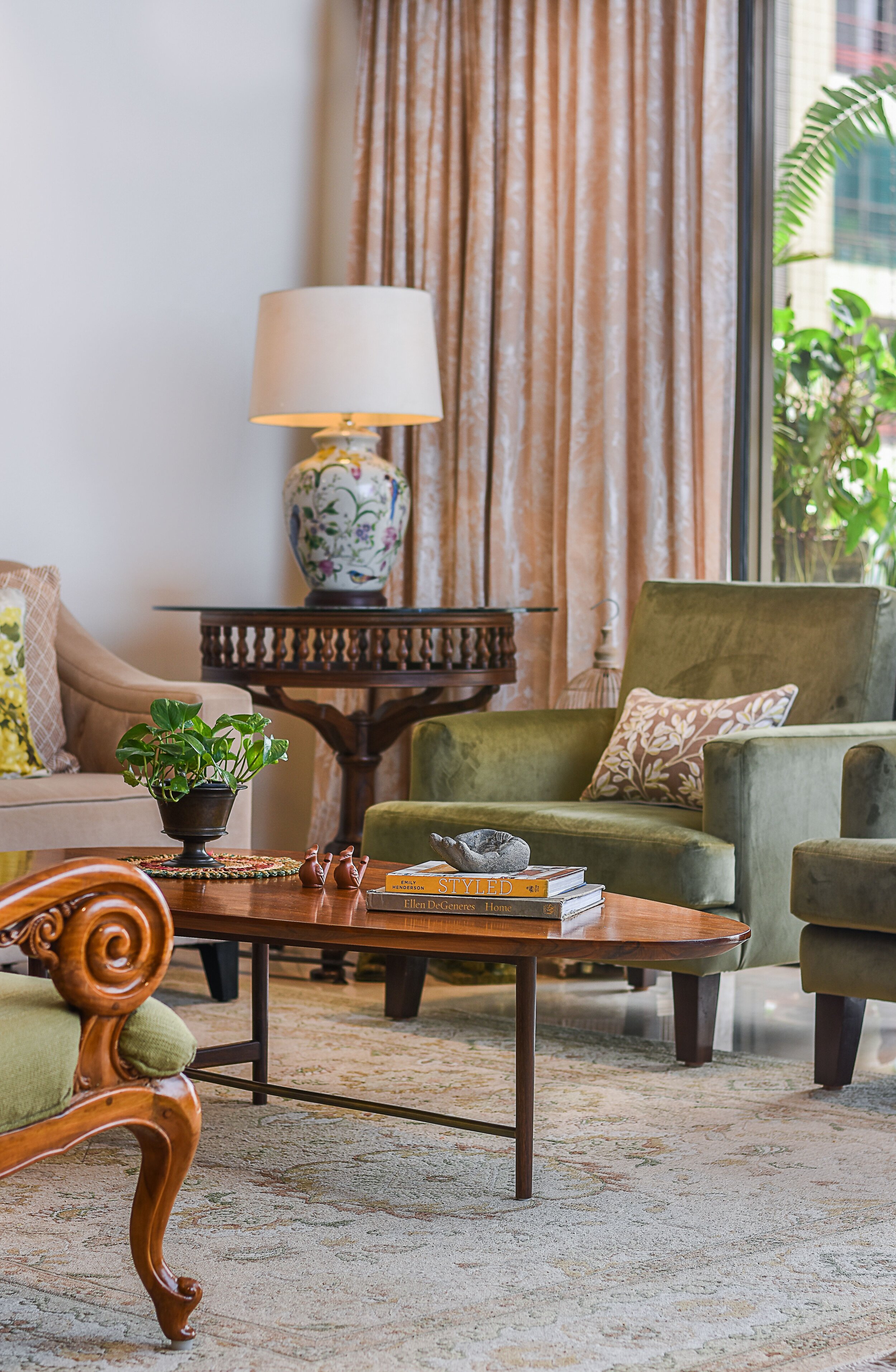
The living room is large but now is doused in warmth, subdued colours, simple flow with strong textures. In this home we broke the straight profiles with a few curves for balance. While the beige sofa and custom velvet green chairs (a new addition to the space) are contemporary. The clients old pieces like their teakwood chairs were re-upholstered in dual fabrics from Vaya fabrics and this made for an understated statement in the room.
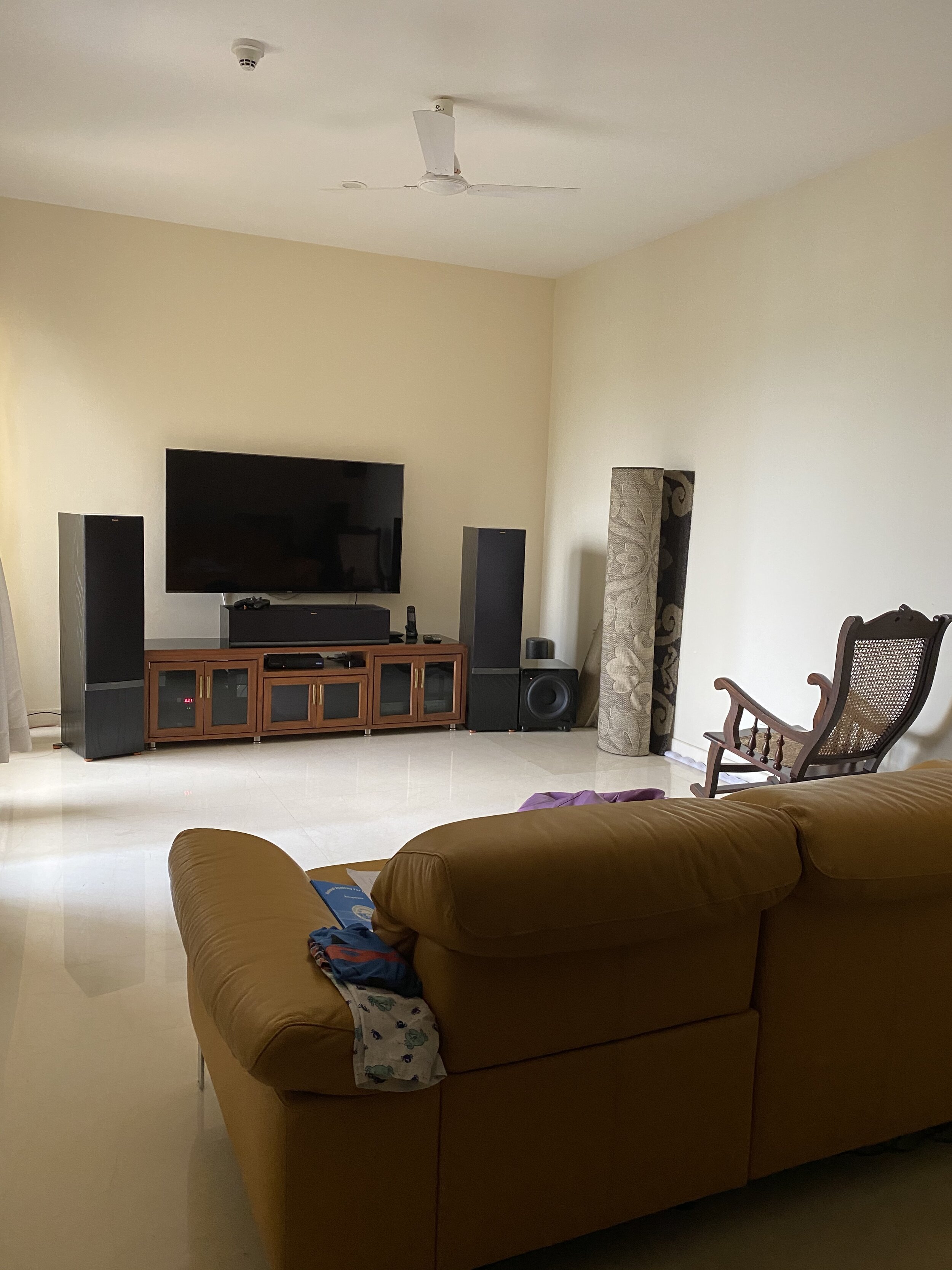
After:
We divided the living area into two zones, this forms a formal seating area and the other for a relaxed laid-back vibe! This sectioning helped the home to look more organised and airy. We also amped up the lighting in the room, before there was no mood lighting in the space. We added laser soft lights in the centre of the room and spot lights as a focus light on the paintings, the centre art piece is by an artist called Vivek Kumavat. By adding a table lamp on one side and placing a floor lamp they already had on the other side helped in achieving symmetry and a good balance in the room.


Shankar’s family hails from Cochin, from his parents home he has acquired a few family heirlooms and the intricately carved rosewood daybed being one of them. We paired the daybed with a contemporary art piece from G.Subramanian (Subra), sourced from iartgalleria.
If you closely notice the corners we ended up fixing antique brackets with a colourful mountain snow lion adding so much charm to this space!
The last thing we did was choosing the right rug for the space! We went with a hand-knotted cream rug with subtle motifs, its muted elegance is just perfect. The coffee table is crafted in teak and being so curvaceous adds that interesting aesthetic, smooth edge and flow pattern to the room.
The balcony is filled with plants with expansive city views. A beautiful bird chandelier from the decor kart is perched above the balcony table.
The Dining Room
Before:
We’ve continued the theme of neutrals into the dining area of the home as well. The built in crockery unit we re-finished in a beige tweed laminate with wicker inserts. Being a rental we had to think of budget-friendly ways to up the decor of the fixed units and we managed to do just that in this area.
The dining table was already with the client, we re-upholstered the dining chairs and added a barely there contemporary glass chandelier with brass detailing above the table! I love the way the floral wallpaper adds some drama and brings back that traditional old world charm into the space.
After:

The passageway leading upto the bedrooms, we painted it in a mauve-grey shade and decorated it with her mask collection. At the end of the passage is an antique mirror that creates an illusion of a never ending pathway.
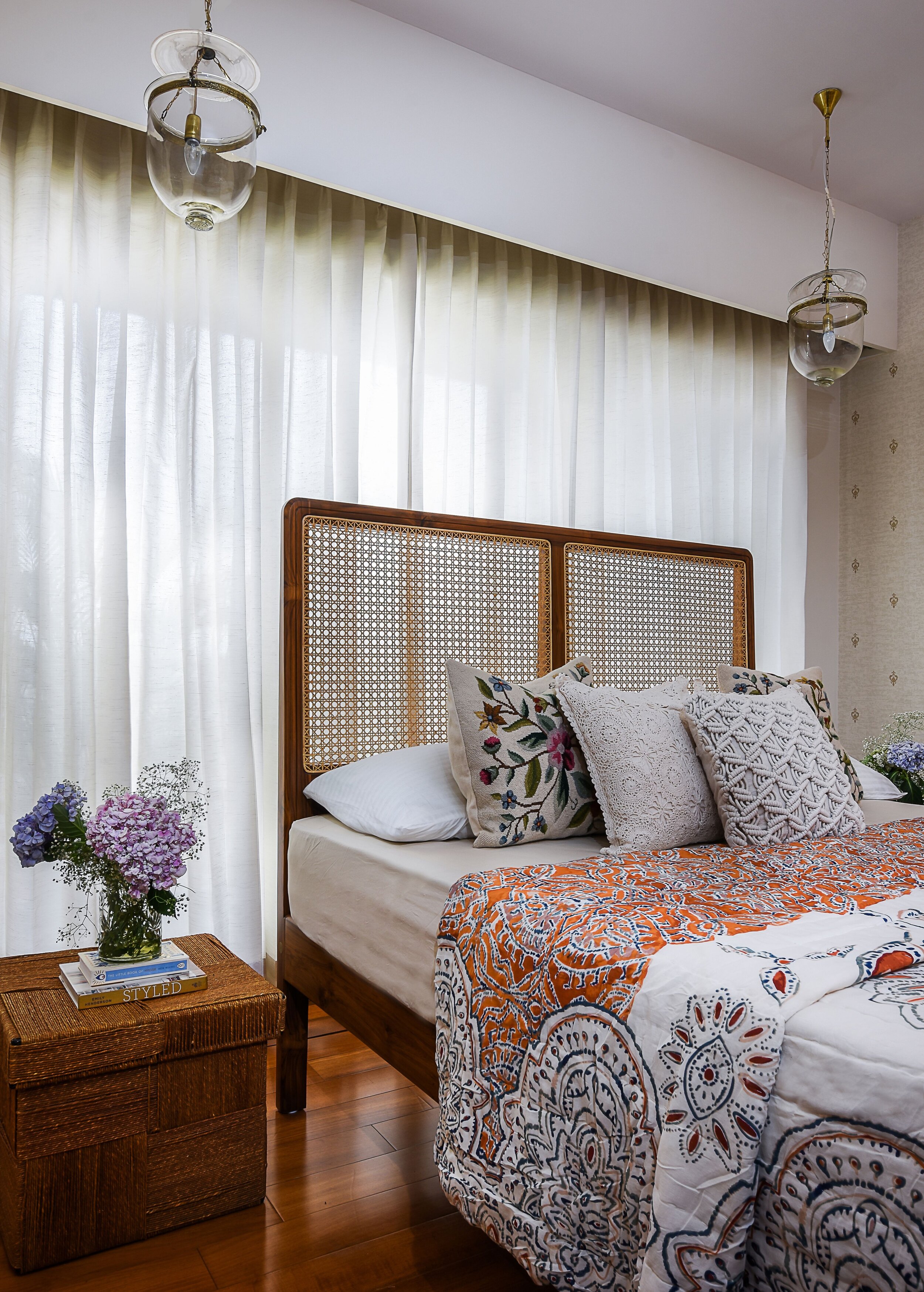
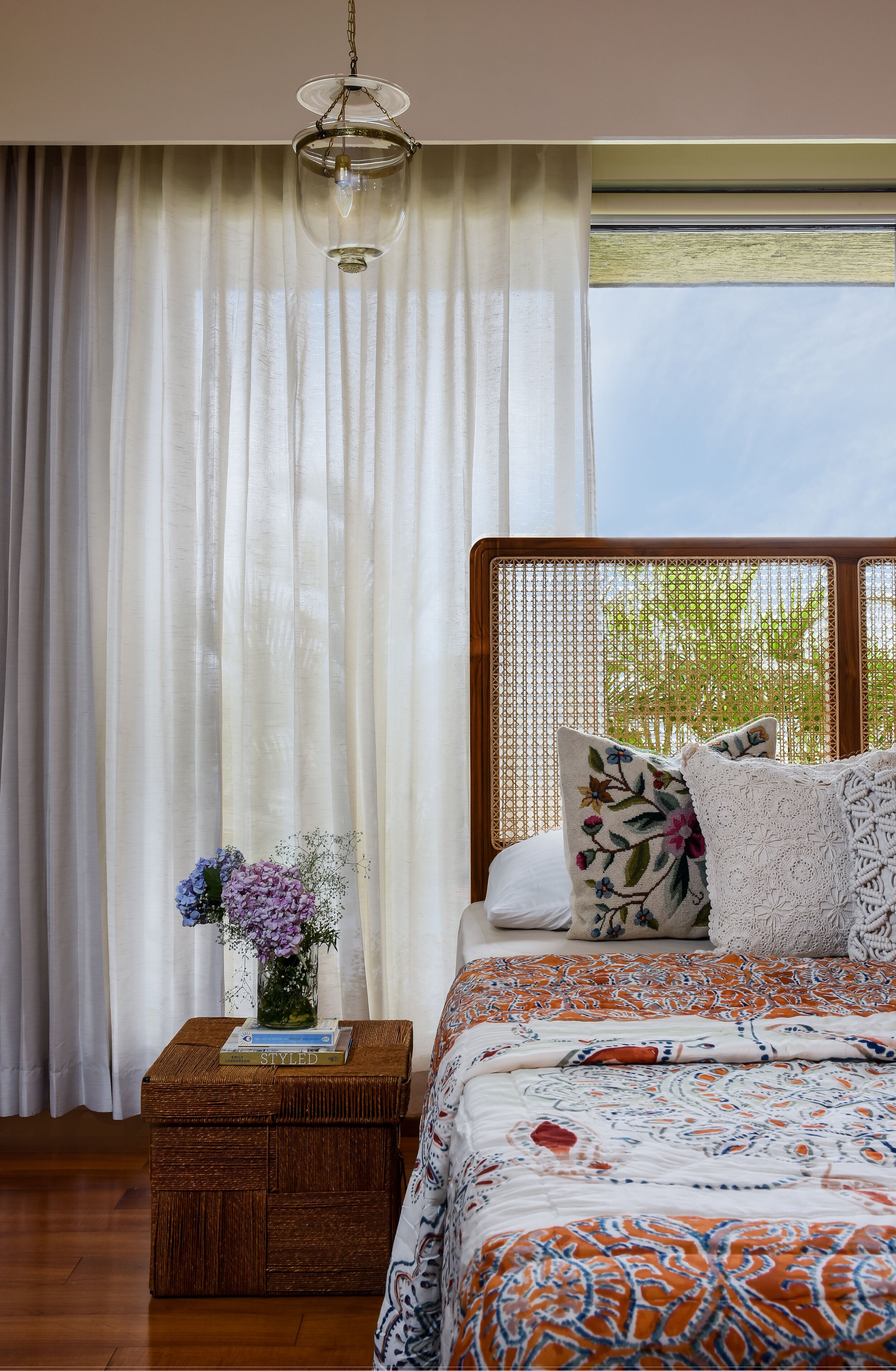
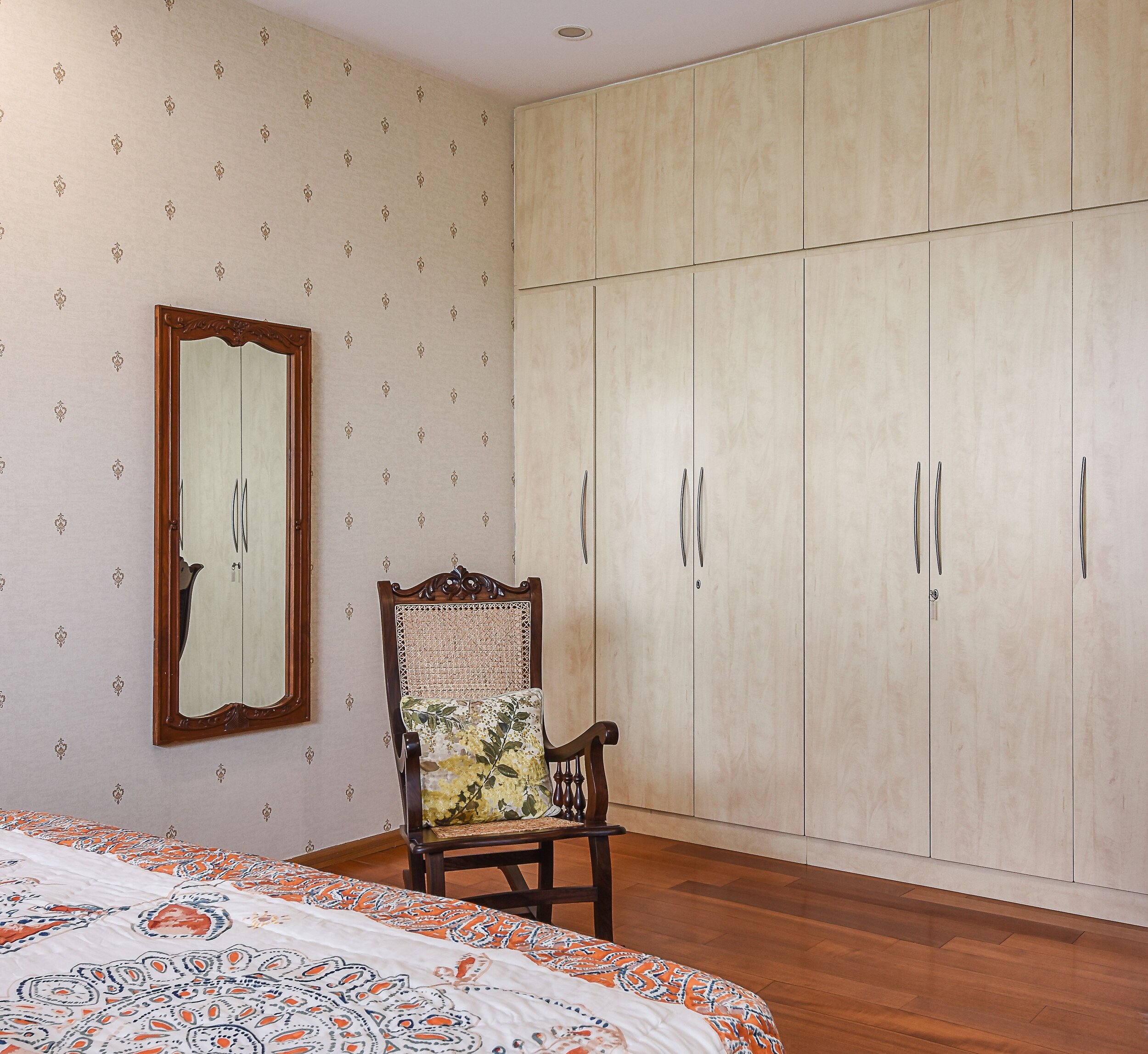
The Master Bedroom
An unconventional setting with the bed facing against the window - that’s how our client preferred the room to be when we played around with the layout and we love it. The bedroom is warm, inviting and comes with an appealing vintage look and feel!
A custom teak and cane bed, a regal wallpaper, a deep hued rug, vintage lighting from Cochin and jute storage boxes for side tables, this room oozes earthy goodness. If you seem to be missing the view outside you can sit on the cane back rocking chair and enjoy the view!
The Kids Bedroom
Before:
We completely redesigned this room and gave it a new look! This room was used as a television room before and our challenge was to re-house the existing TV and sofa in another bedroom. While we did so, since the other room was smaller we realised we had to remove the existing wardrobe in that room and relocate the same into the kids room so the sofa would fit. This was our first challenge and the next was to hit the brief given to us by Rashmme and her two kids.
We finally came up with a design concept and went for a board and batten half wall in a Verde blue duco color. A board and batten wall is classic and works as a feature wall that you can never really go wrong with, blending into most styles!
After:
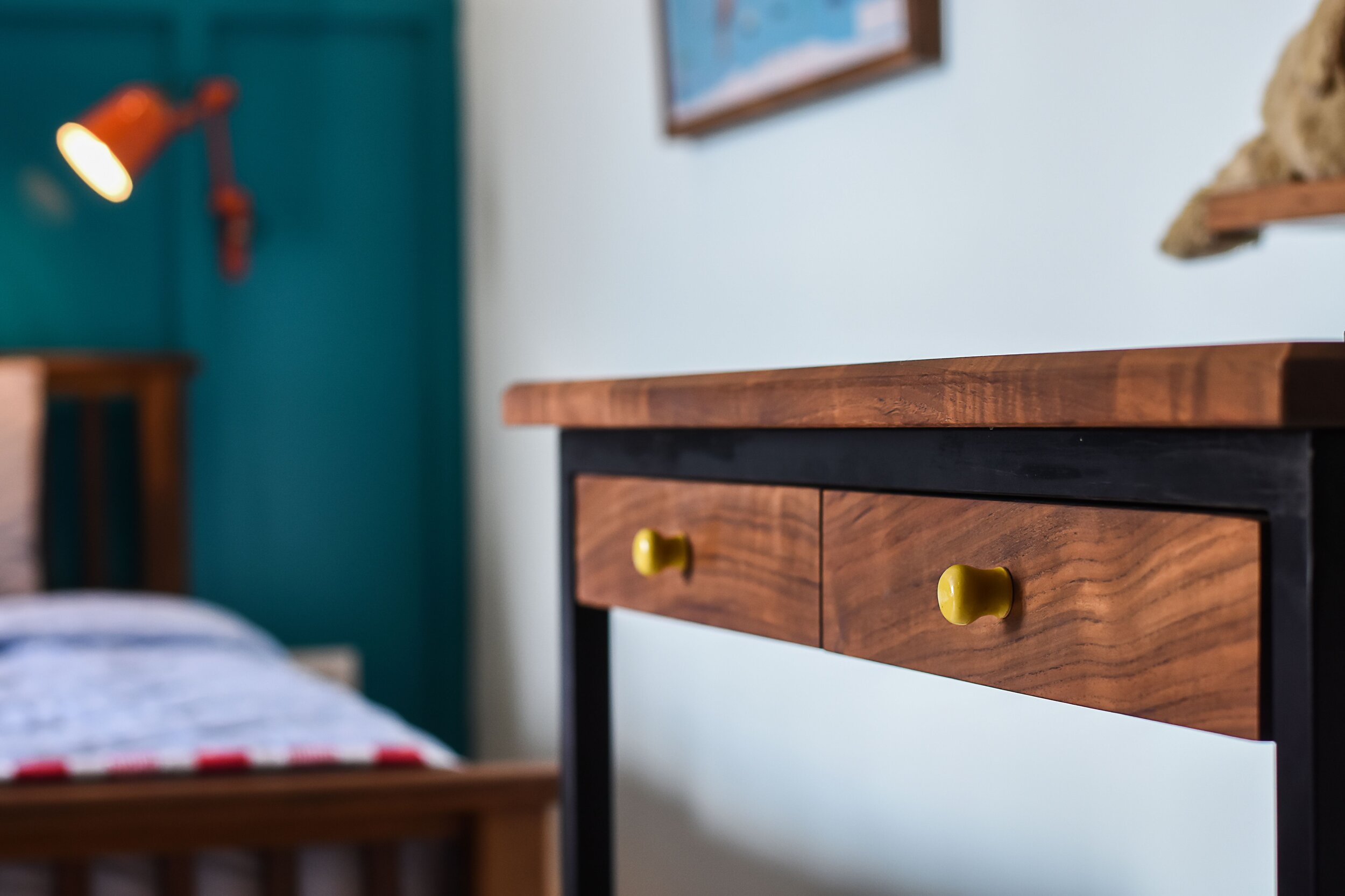
The beds are custom made from reclaimed teak with slatted details, one bed comes with a trundle and the other with a drawer for storage. Rashmme was particular about the wood used for all her furniture as she wanted to invest in quality pieces that can be taken along with them even when they move. The beds and shared side table is clean-lined but sturdy at the same time and by maintaining the wood and wood tone we don’t steer away from the design story of the home.
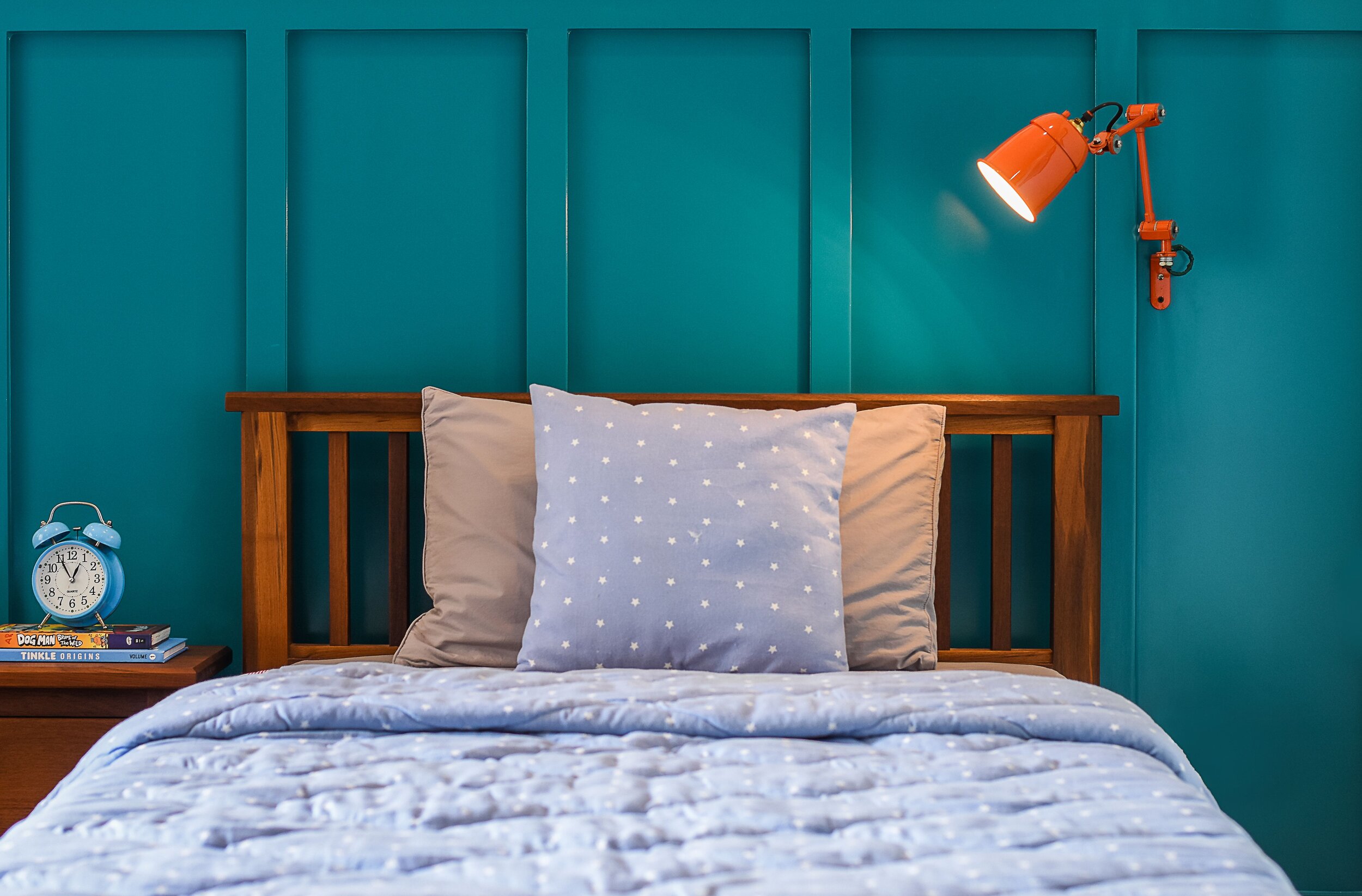
With the study tables we brought in some metal detailing on the legs to break the monotony of the same wood used for the study table top and drawers. The kids wanted their own desk and each desk also came custom fit with a pin board, a place for them to be ideate and pin away! We added some quirk with the yellow ceramic knobs and the orange bedside table adjustable lamps on either side of the bed.
With the artwork we kept it colorful- framed an adorable elephant painting the client had and a world map print with fun detailing that identifies the animals around the world and from where they belong! We chose to update the furnishing as well and went with a lovely duck egg blue stripped fabric from Ddecor for the room and custom quilts for the beds. We painted the rest of the walls in a pistachio sea shelly shade and this added some softness to the room.
Lastly, the showstopper being the wallpaper which is a colourful, fun origami print that we custom made for the room. Since the room is shared by a girl and a boy this print wraps up both their likes on one wall.
Wallpaper by: DesignbyMetamorph
I hope you enjoyed this home tour and walkthrough of each room we worked on. It’s been a pleasure to do this home and we would love to know your thoughts!
Much Love, Nain