
A Virtual Tour of a Co-Work Office called My Spaces
Client: My Spaces - founders Ankita Vashistha (venture capitalist) and Sanath Shetty (real-estate developer)
Interior Design Studio: Nain Belliappa from Houseof9Design
Lighting Design Consultant: Harshita Shetty from Light Inspired Thinking
Photo Credits: Shalini Siva Prasad from Orka Photography
We met the clients to discuss this project in July of 2019. Our clients being young entrepreneurs wanted the space to really pack a punch in terms of design but also stay true to comfort, form and function. Spread over 7000 square feet, seating 65 people- this office is eclectic, striking, spacious and green, located in a residential neighbourhood in Bangalore. The coronavirus pandemic lead to a few set backs! An almost complete project came to a standstill.. a four month delay in execution to be precise but in the end once the lockdown was lifted we managed to wrap up this project in June 2020. Learning to adapt with covid our clients plan to work with fewer people, following health and safety protocols, where you can still distance and is just the workspace you need.
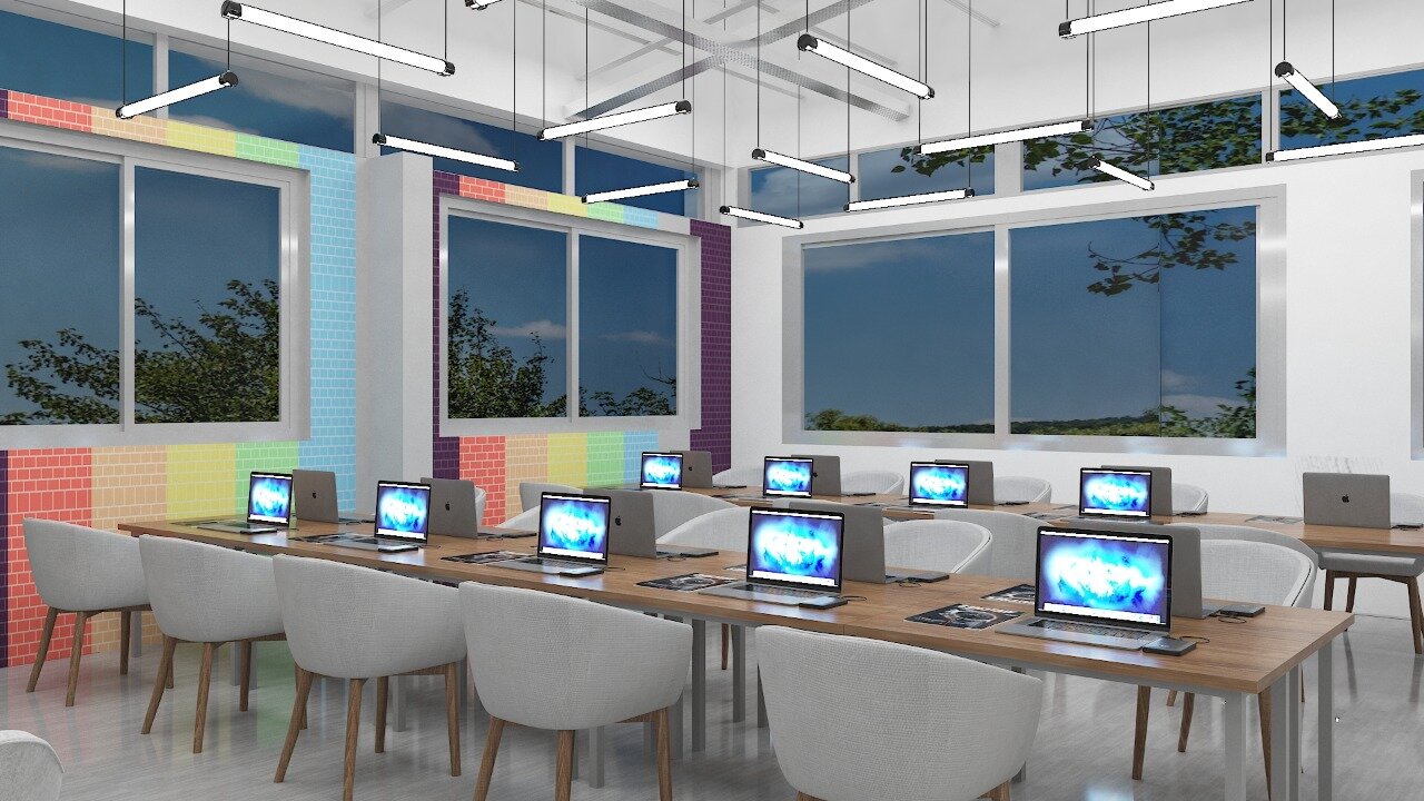
This office takes over three floors of a converted home in an upscale area, two of the upper floors were added a few years ago with the intention to turn the plot into a commercial space. Inside we had a lot of space to experiment with. This lead us to using eye-catching, vivid colours and textures on the walls and floors. You can see our spin on the ombre wall on the main work floor, interesting cement finishes on most other walls and a super funky rainbow brick wall in the hot desk area.
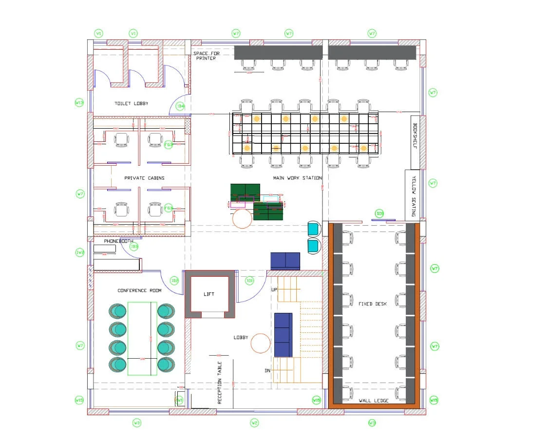
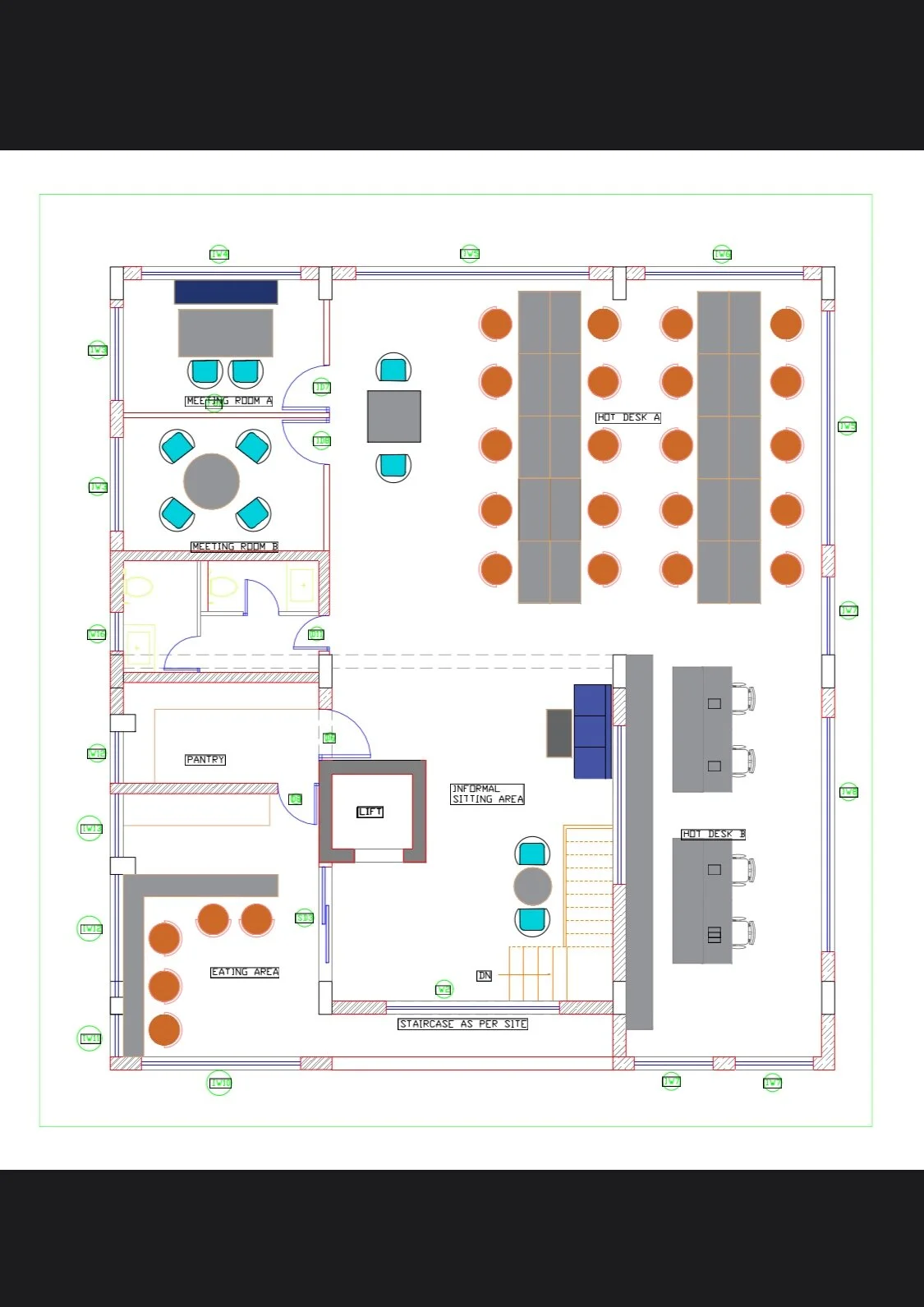
THE FLOOR PLAN AND FURNITURE LAYOUT
A good layout encourages flow and productivity especially in an office space and that’s what we aimed to achieve. Attached below is the layout planned for the office, workspace seating zoning with formal, informal and spill out areas.
We would like to think of this project as a community innovation house, designed to network with people with ideas to create!
THE DESIGN CONCEPT
The office is designed to fuel communication. Every room in the office is open, filled with greenery and is vibrant so a person can bring their best to work everyday. The office being in a residential neighbourhood inspired us to make the office feel as home-like as possible, this comes through with the art selection, wood detailing, bookshelves and cozy sit out corners surrounded by lush treetop canopies. These window views to begin with already had this feel good factor.
Explore a few of the renders and initial design concepts presented to our clients!
SPACES
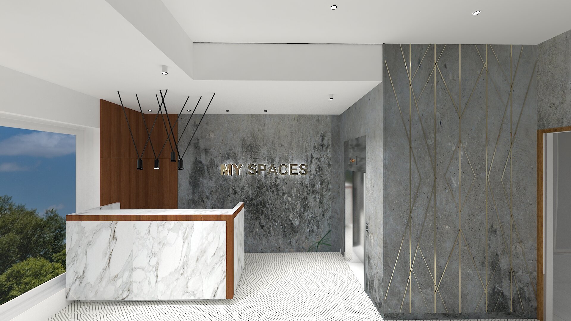
Let’s begin with the third floor… . Taking you through the spaces beginning with the entrance area, the reception!

Before: The old walls were bland and covered in granite from floor to the walls.
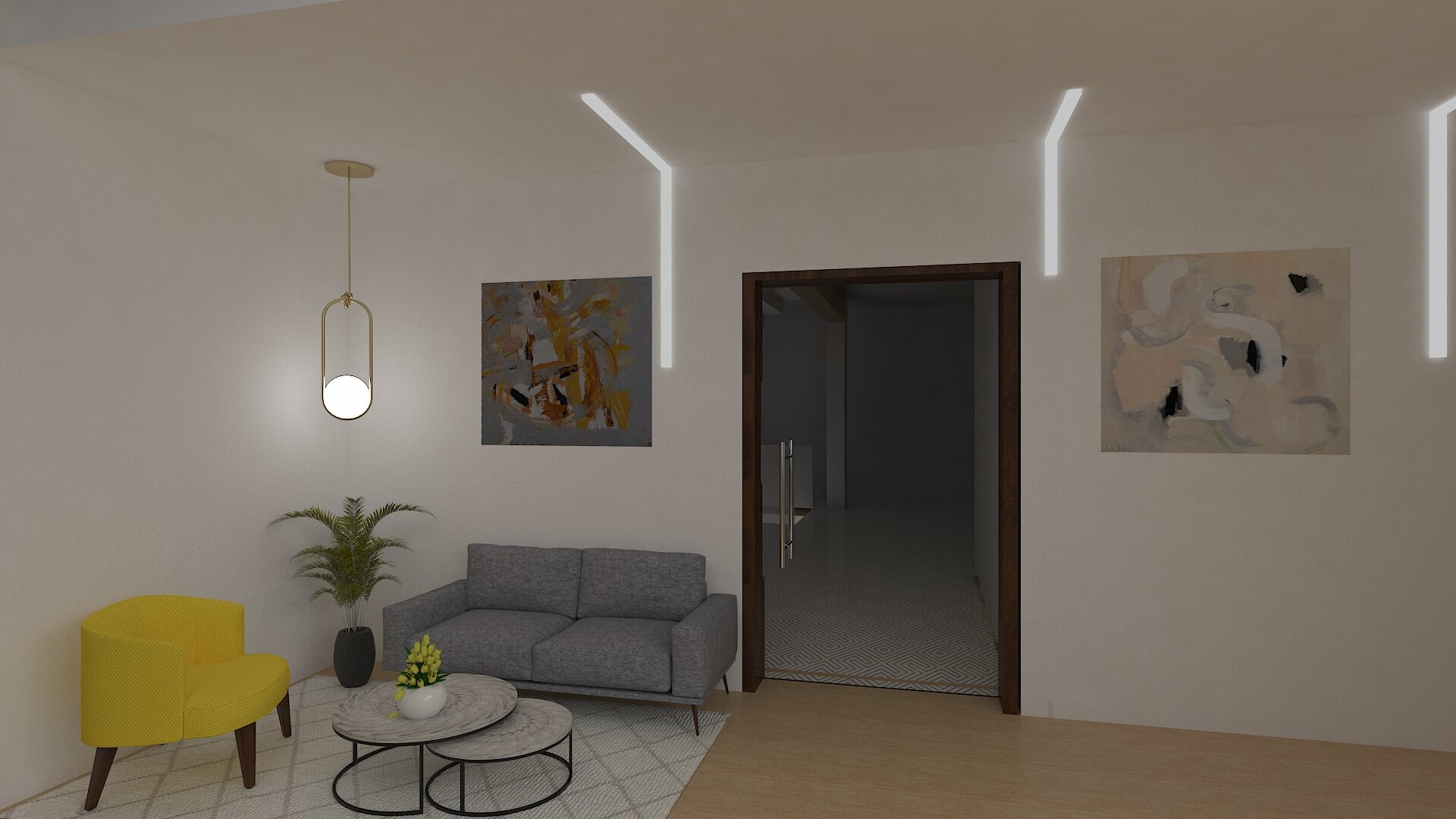
After: The lift opens up to the reception area on the third floor. We wanted to lend a formal, classy feel to the space. A good first impression can work wonders. We went with a sophisticated material palette! Here we went with a three-textured shaded cement finish on the walls, statuario veining on the table, with veneer and brass detailing all round. Patterned cement statement tiles, sourced from Cubittiles adds interest and dimension to the entryway.
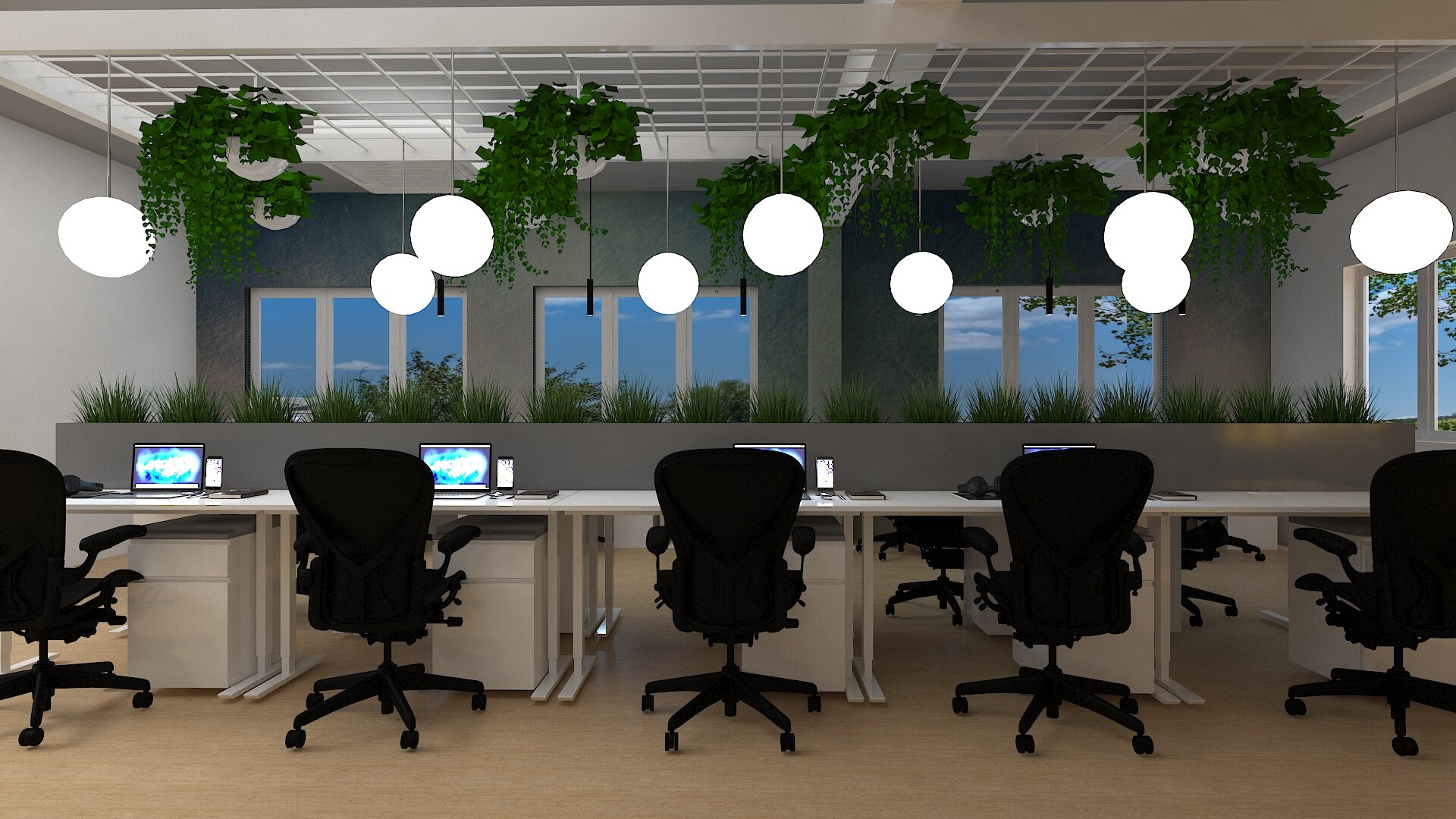
Inside you will find the main work stations and since this area receives lesser light then the floor above we went with lighter workstations, mostly white or light wood tops. The work desks, filing cabinet and chairs on this floor were sourced from Featherlite.
Before:

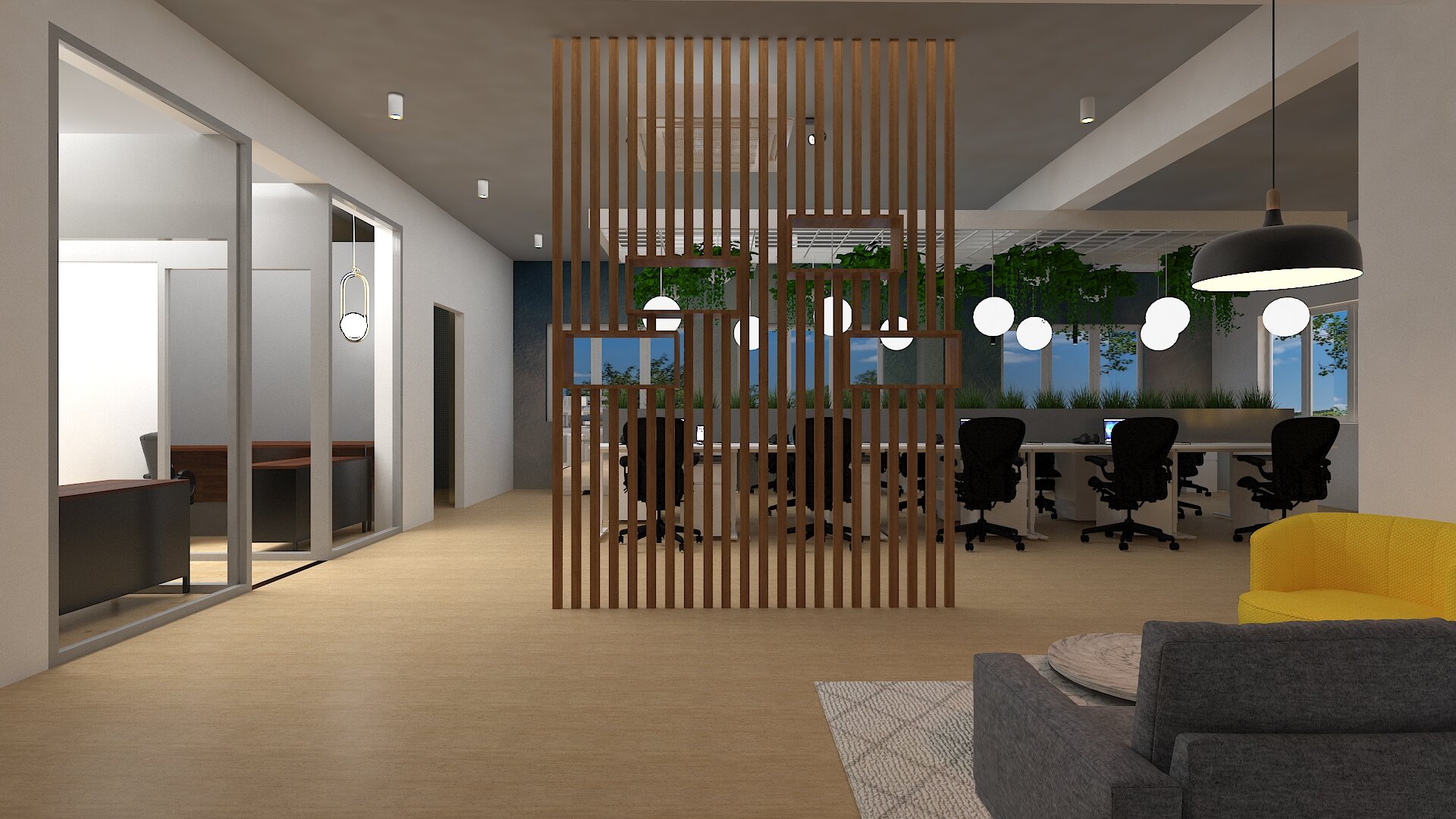
One of our absolute favourite transformations! The wood partition was designed for privacy from the reception view. We love the play of light and shadow that passes through this sleek partition design. This somehow made the space seem even more spacious and we love the statement it creates!


It is interesting to note how the ombre wall and the yellow seating by the window adds pops of color to this otherwise understated practical workspace. An open floor plan separated with glass walls framed in a grid design allows for open networking between rooms.


In the conference room and the private cabins, we went with a dark walnut finish lending a lux feel to these spaces. The office is fit with 4 private cabins, the art here adds so much depth and drama to the space!
The custom 8’ long epoxy table in the conference room is another favourite furniture piece! We adore the custom bookshelf that envelopes the room in a warm tone, styled in white- minimal and neutral with a classic geometric print wallpaper. Lighting pop up boxes are from Legrand India, and the lovely teal swivel chairs are from Urban Ladder.
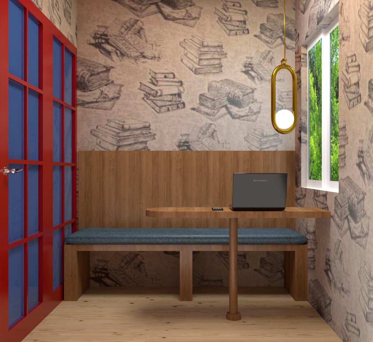
The telephone booth is London inspired- as it happens to be our client and our favourite city. We used book wallpapered walls and a traditional console to create a Victorian stage set.
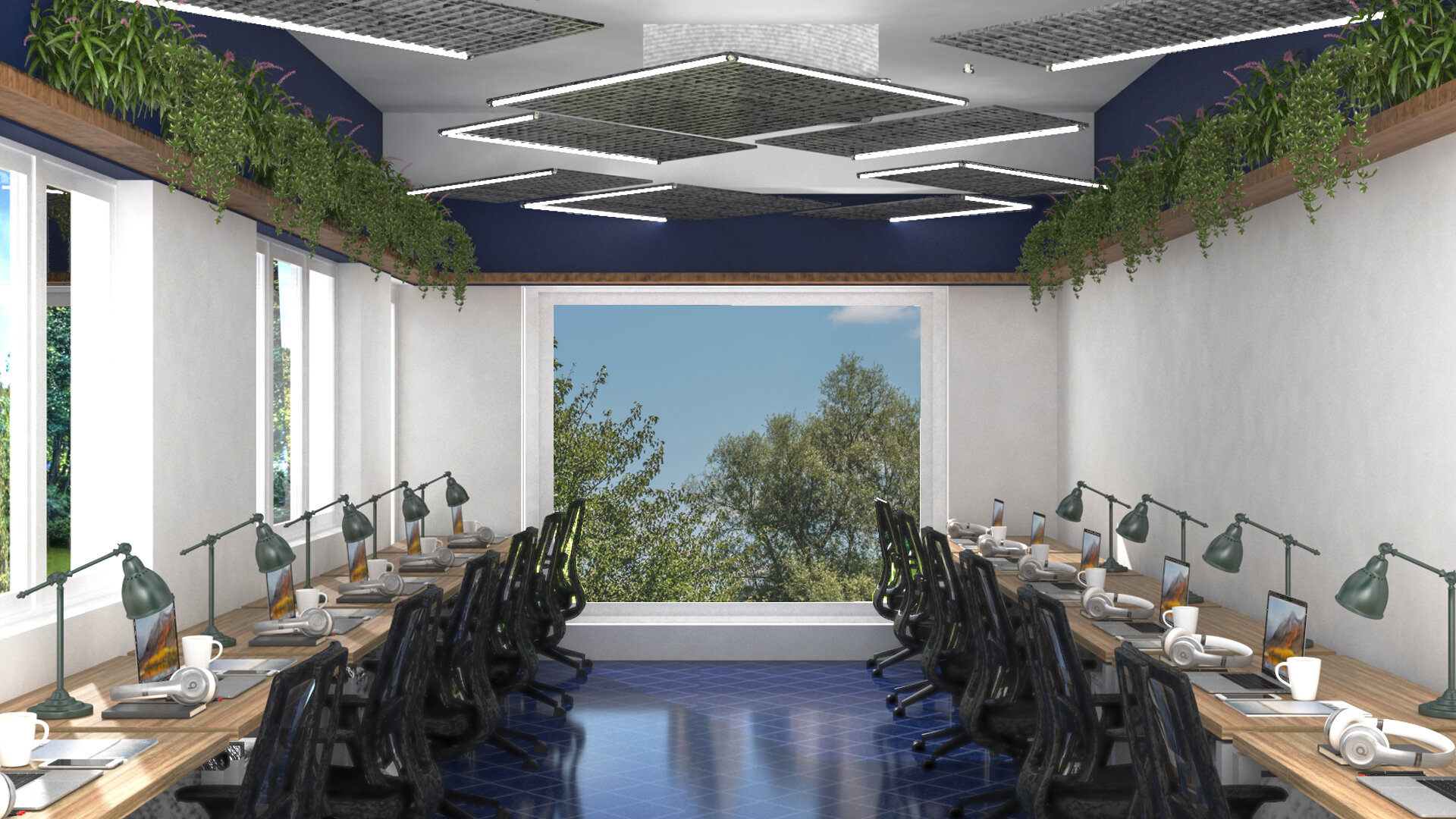
Termed as the fixed desk zone, this space is a private 12 seater keeping form and function in mind. These amazing custom lights makes for a suspended impact with a little out of the box thinking! The geometric pattern laying off the lights are mirrored on the floor and the color of the tiles on the floor are color blocked on the walls. Whichever company that takes up this space are free to decorate the walls to their liking!

Before:After (above)
SPACES- 4th Floor


Above are a few pictures of how this space looked when we walked into site on the first day.
Now with a bold colour palette this floor encourages work and play. This space functions to be casual and flexible.
We tried another pattern using the same cement flooring on the landing in this floor.
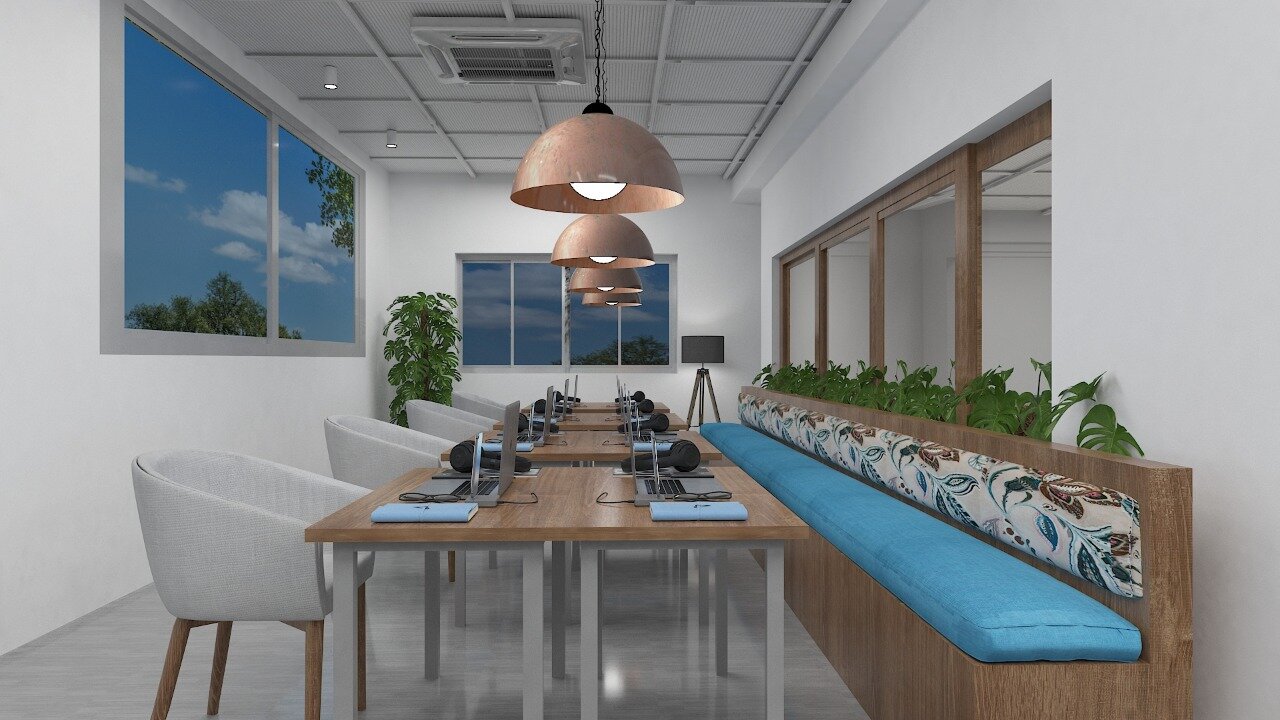
This floor is more informal with spill out areas and a long bench seating. The hot desk area, its fun, playful, spacious and colourful. Here the tables can be pulled apart and placed at a side, so this space could also function as room for large gathering talks, webinars, and events.
We went with a light oak finish on the table, the tables are custom designed with Featherlite and the grey chairs are from Urban Ladder.
A super cool tube light installation is the star of this space, the lights can be dimmed suiting the working needs of the space. So this light feature isn’t just sculptural but is also functional!
The two semi-private meeting rooms was a blue and yellow vision we had in mind come to life, they were designed to be same but different. We went with a distempered pigmented cement finish, brick clad white walls and custom flooring complimenting the color scheme in each room.


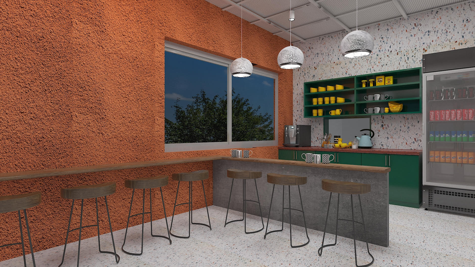
The pantry is finished in terrazzo from flooring continued to the walls, matched with the right shade of warm teak and painted in a red earth concrete texture. The grey is punctuated with bursts of emerald green on the shelving and the shutters below. A rolling shutter once opened is access to a fully equipped kitchen on the other side.

Before:After (above)
The final floor was an addition done along the way towards the end of the project. A stairway from the pantry goes up as an extension of the cafeteria area.
A terraced outdoor space welcomes you! Complete with a vertical garden, bench seating and bar stool seating with a view.
In the end we believe when you let your ideas run wild, its equally important to have clients who believe and trust in you and let you do so. We are so grateful for the opportunity!

Here’s a team picture taken on shoot day! We would love to know thoughts on the space.. Drop a comment below and we’ll be more than happy to get back to you!
Signing off xx
-Nain